It was a joy to see the room filled to capacity at our Club meeting in March. The usual members were there, scholars from the newly established Hermies Photographic Club, visitors and prospective new members.
Phillip de Lange, PSSA director provided some feedback on progress made with Youth Clubs. He outline steps being taken by the PSSA to identify photographers transgressing salon manipulation rules. Then it was time to provide feedback on the images entered. Below is a brief summary provided by Phillip and Louise.
Judges: Phillip and Louise de Lange, Witzenberg Photographic Society
VISUAL ART
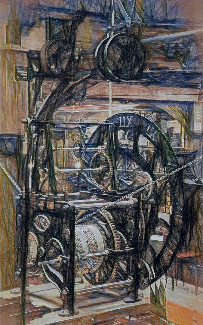
A very interesting scene. Full of detail but also intriguing to look at. The effect created suites the image. Although at first it looks busy one’s eye does settle on the time wheel with the numbers. By including the top two pulleys the composition have been strenghened.
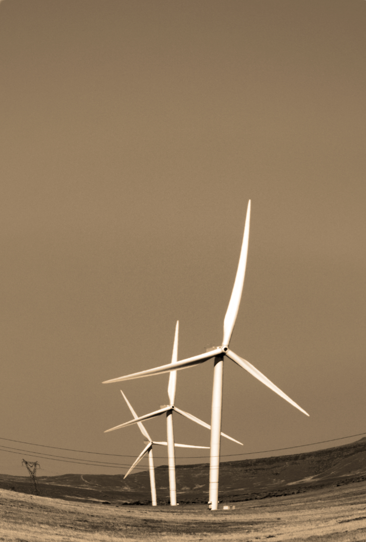
A good try on visual art. The line in which the three wind turbines are placed add to the composition leading the eye into the image. What is a drawback is the power pylon in the back which the photographer could have removed.
PORTRAITURE
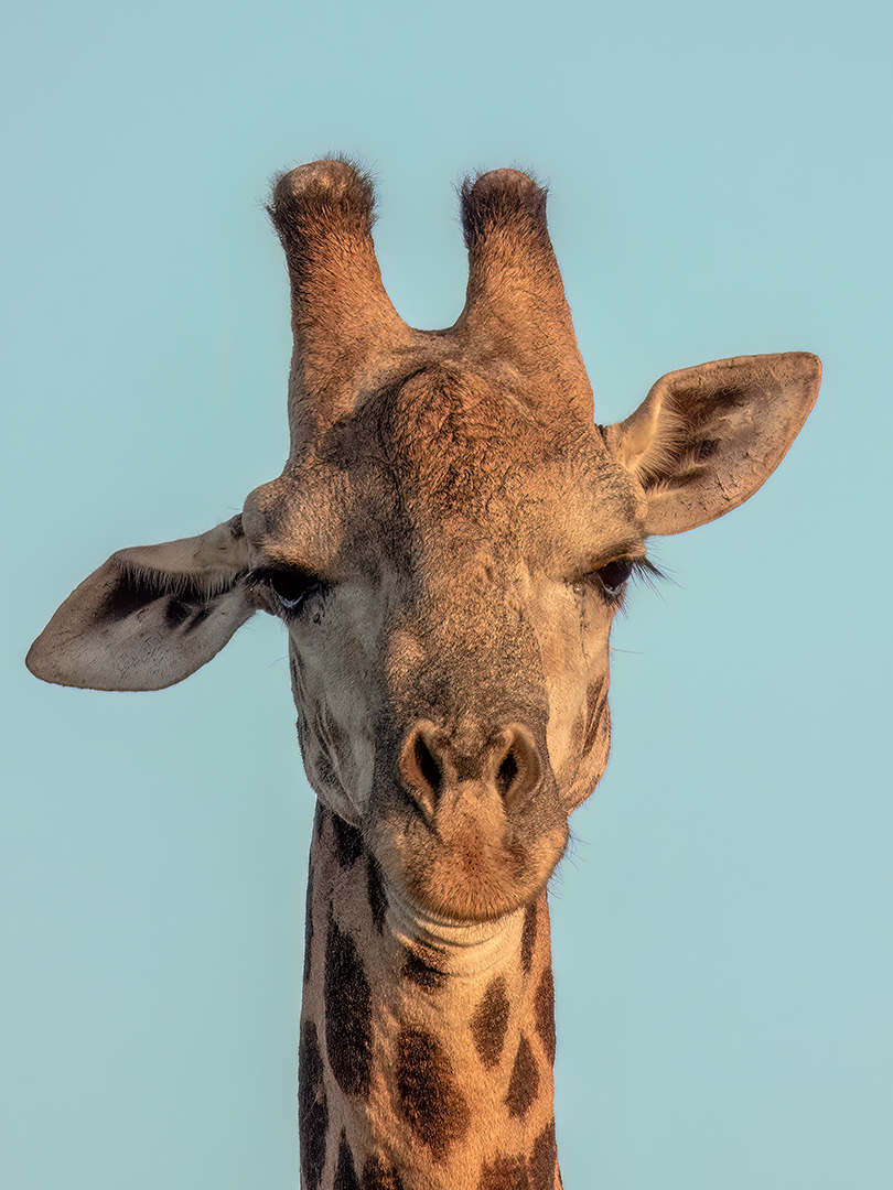
With the ligting from the right you have beautiful detail on the Giraffe’s face. To better this image give a little more space below the face. (if the author still possess the full image of the Griraffe). The image is too tightly cropped with the face set in the centre.
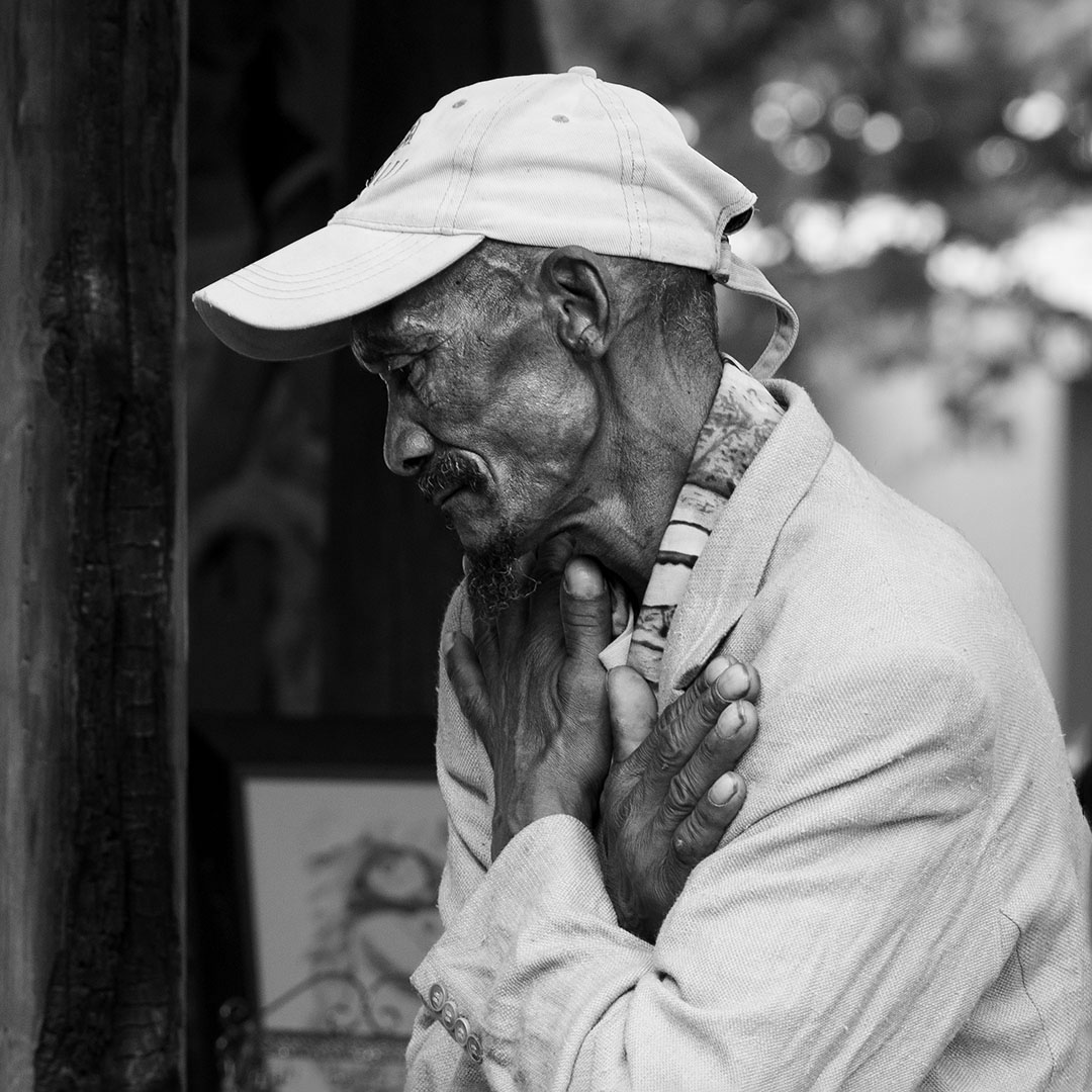
Well seen and captured. The detail on the skin is commendable and a plus in the image.
PHOTO JOURNALISM
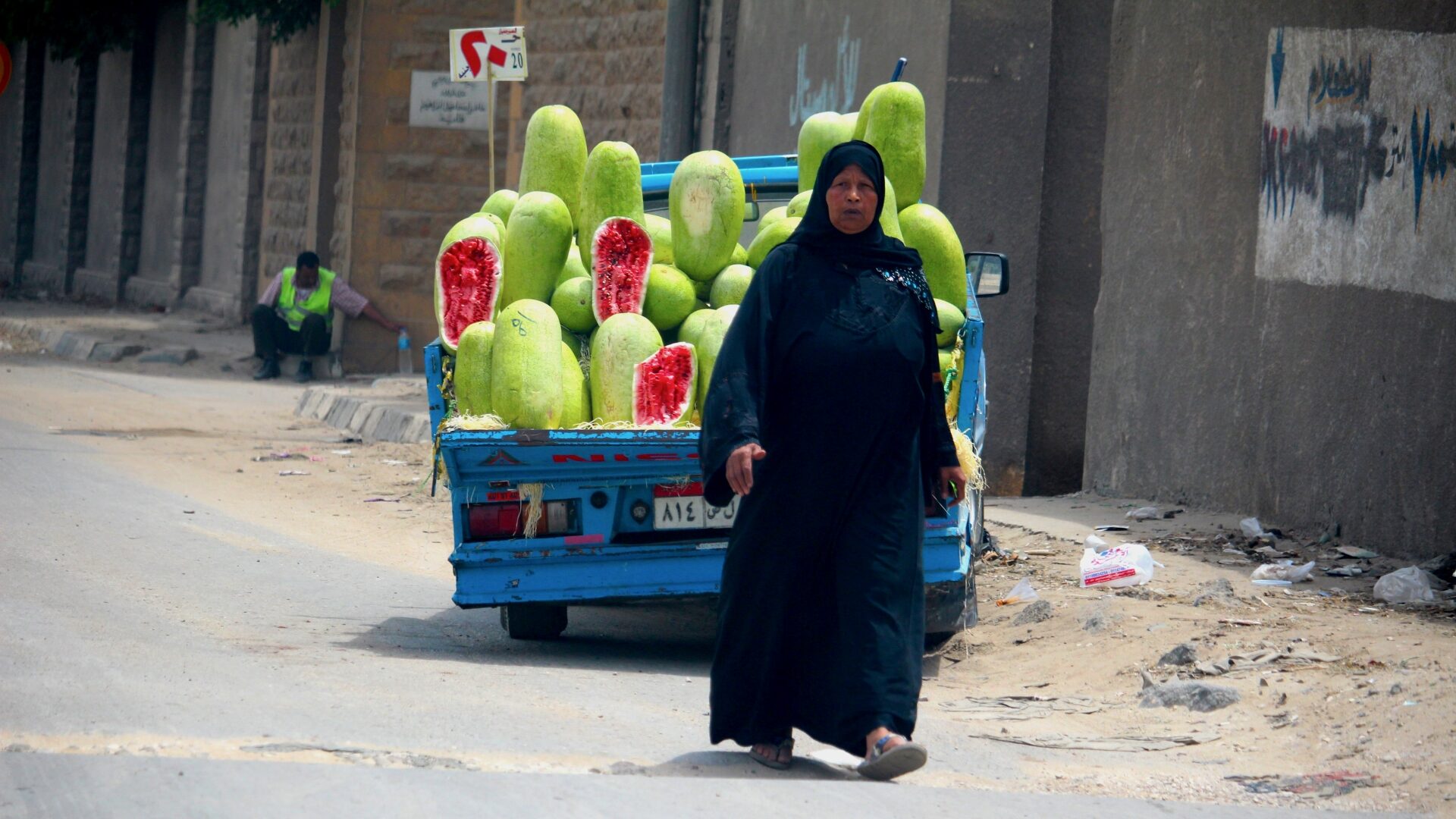
Well seen and executed. The drawback in Photojournalism is that you have everything around the woman also attracting attention. To better this image it is suggested that the photographer crop out the person with the safety vest (left) to keep the attention on the lady and the Watermelons.
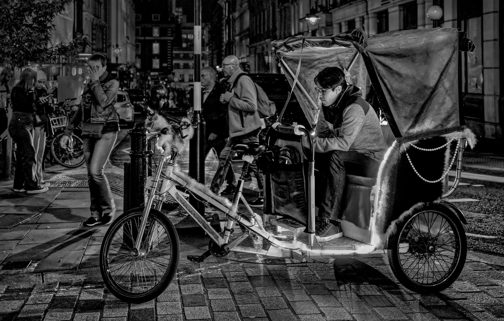
A beautiful black and white image. The bike and the person sitting in it commands all the attention. Even though the lady that is holding her spectacles does not distract from the scene but adds to it. Nice and sharp and lovely detail throughout. The photographer succeeded in creating a feeling of exclusion of the rickshaw from the rest of the scene with the people just walking by and ignoring it. Well done.
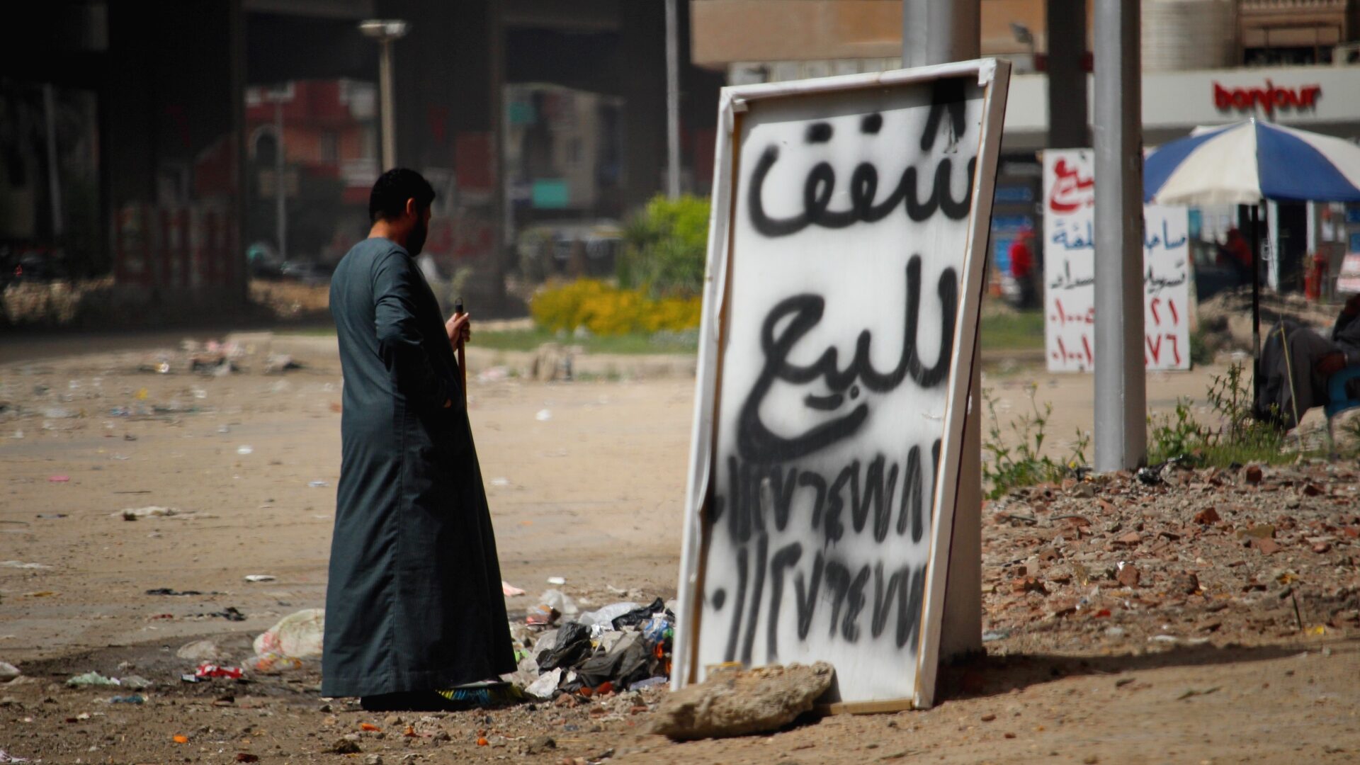
The title and the image together creates confusion. (The author know what is happening but the title given creates a question). To the viewer it shows a man cleaning up all the rubbish. If the author waited a bit to show the man’s face it would have helped. The rock in the foreground is also distracting by not being in focus.
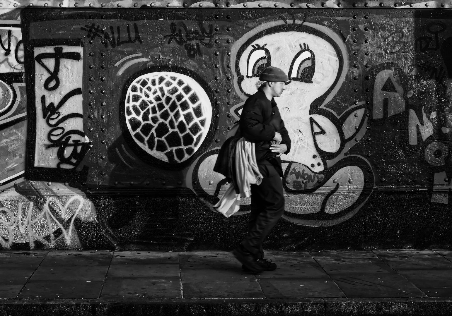
Well seen and presented. Yes, Tweetie is watching every step. By choosing the black and white conversion of the image the author prevented the Yellow of tweetie taking over as main focal point. Here it surrounds the model and let him stand out better. To better: crop of the left third to eliminate the graffitti painted on the wall.
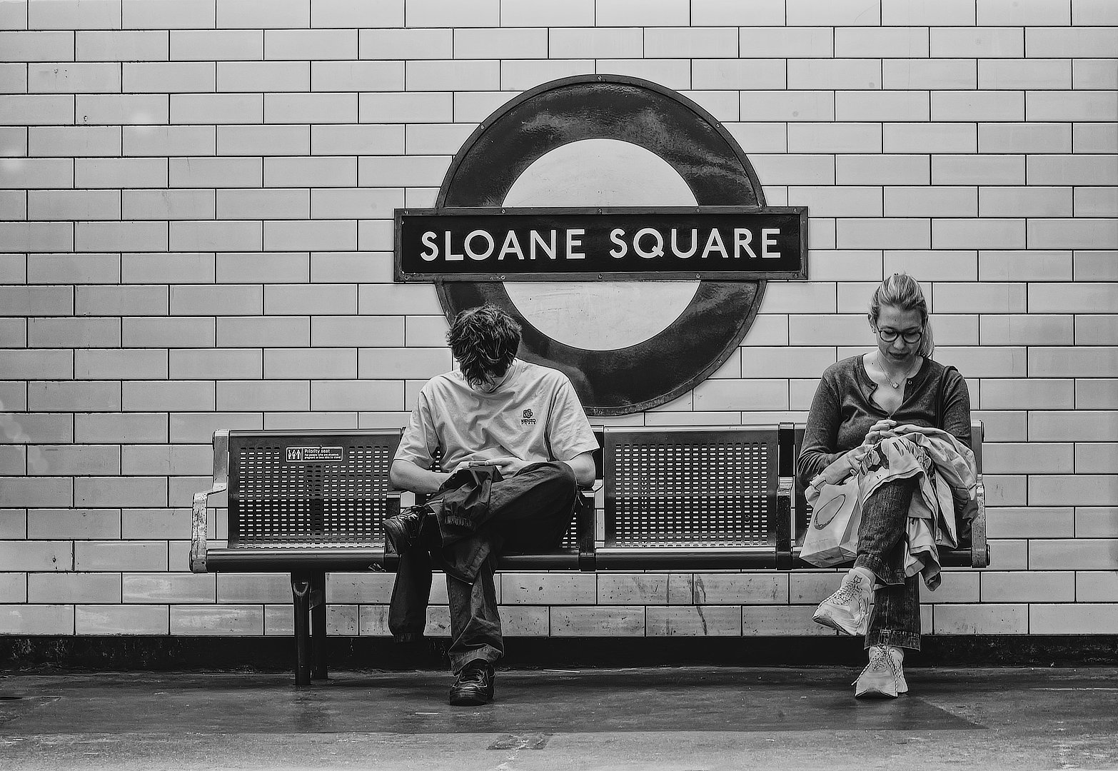
A pure clean conversion to monochrome. Well seen and captured with both the commuters clearly shown and in focus. The Circle behind them causes the eye to centre on that spot and then down. Lighting is correct with enough detail visible throughout the image.
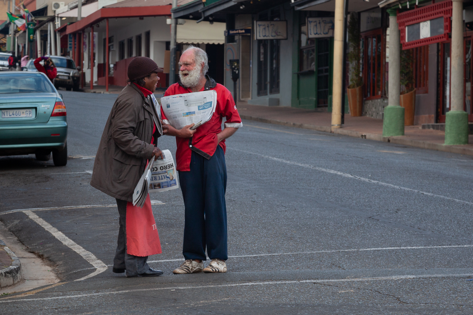
A very good storytelling image is presented to the viewer. Nice sharp and very good detail on both the sellers and the newspapers. A portrait crop of 8 x10 is suggested to cut out the vechile (left) and the yellowish pillar (right). Might be very interesting to see it presented in monochrome.
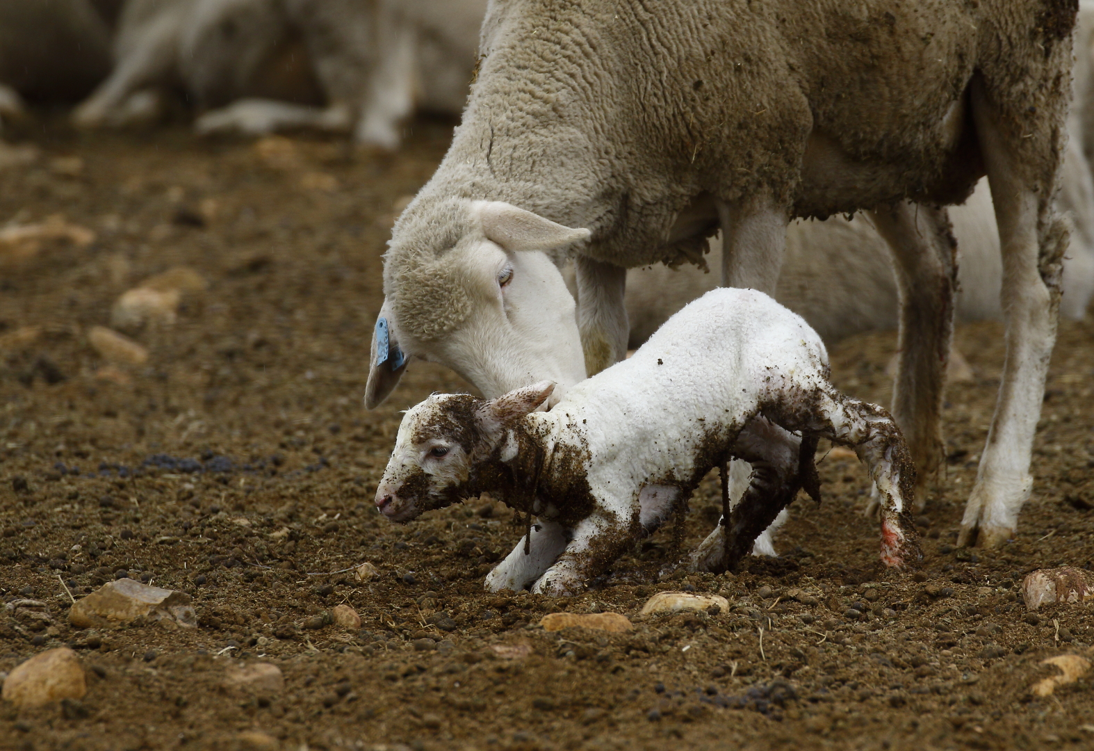
Well seen and captured. The young one is the middle of attention in the scene. A suggestion is to crop of a little on the left to cut out the rocks in the left foreground. The brightness of the rocks are competing for attention.
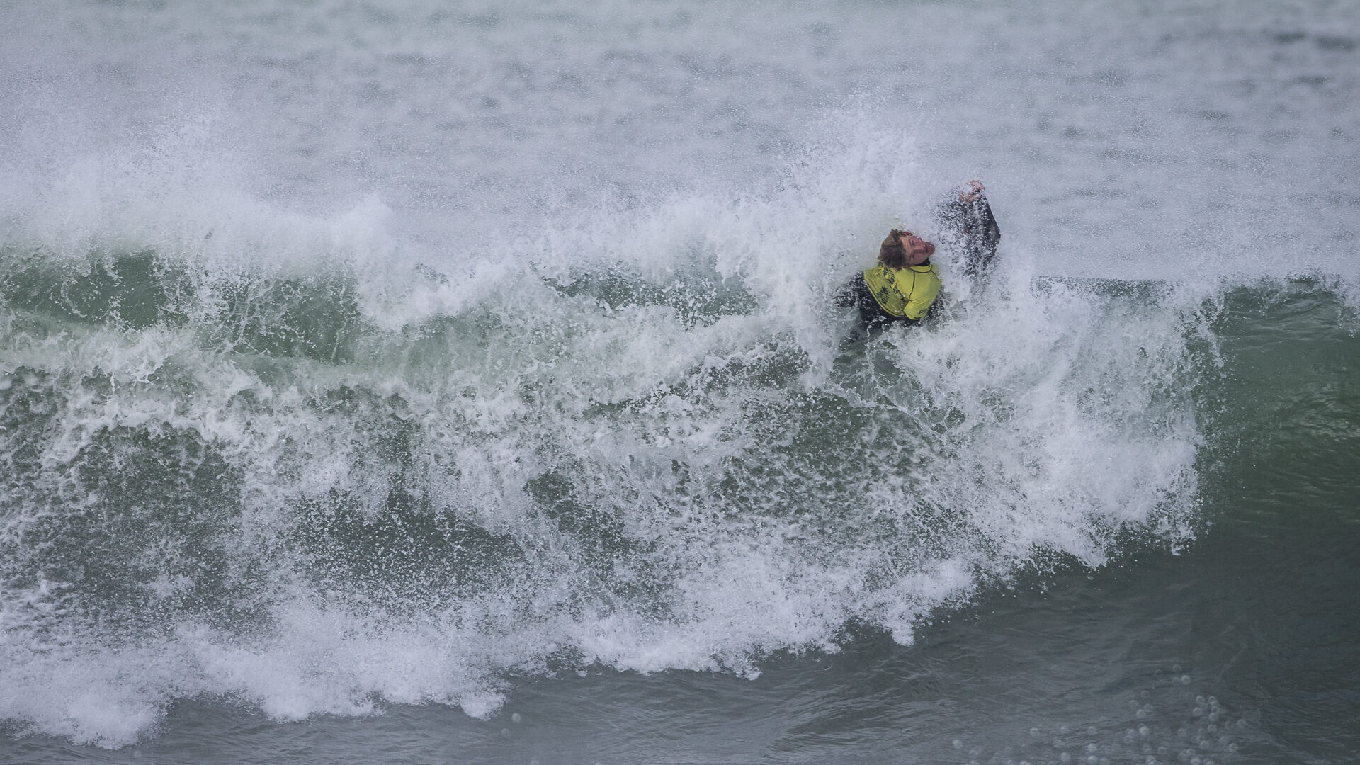
It takes time for the eye to settle on the surfer. The position of the surfer appears uncomfortable at first but on second glance the image can be seen more clearly. Very good action and freezing of the wave. To better – it is suggested that the photographer use the levels to better the colour quality of the image.
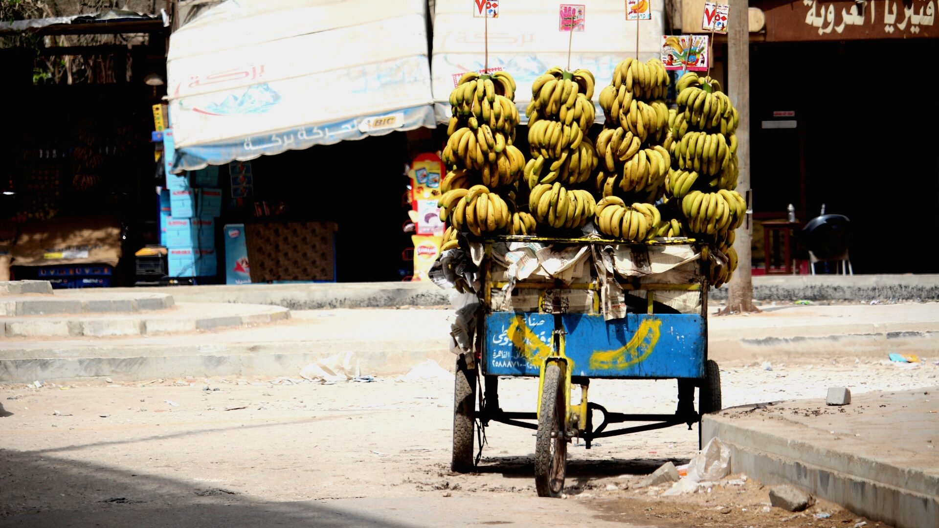
Harsh lighting and burn out in different places can be seen. The banana as main focal point need to be sharp in focus but appears a bit soft here. The viewer’s eye wander from left to centre and back. A different crop is advised to cut out competing colours.
NATURE
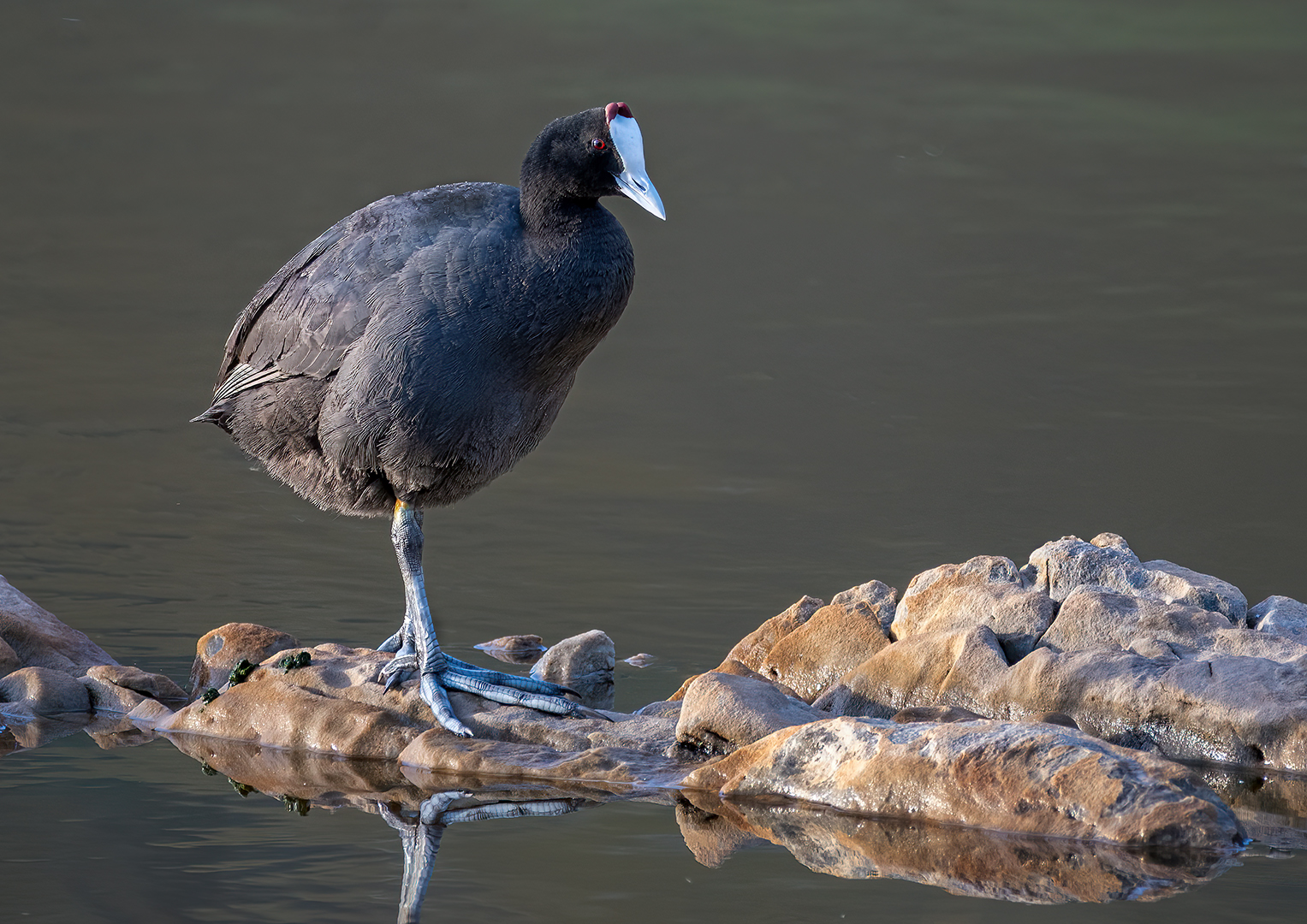
Lovely sharp with detail visble throughout the image. The highlight in the eye is a plus. The reflection in the still water helps to add to the final presentation. A little use of the levels in post processing to darken the foreground a bit to help to make the coot stand out more. The light on the rocks are as it is a bit distracting because it is lighter than the coot.
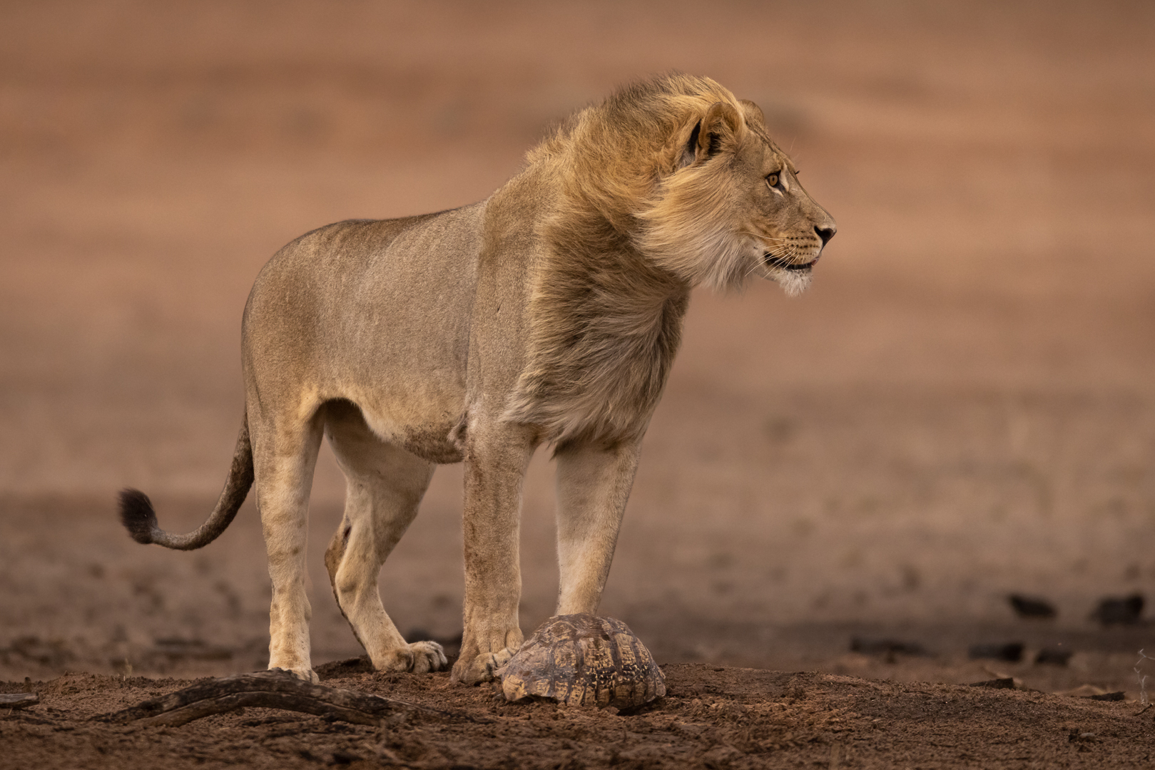
The Lion’s expression says it all. Lovely sharp where needed with both the Lion and the turtle in focus. The out of focus background helps to keep the focus on the Lion. Nice soft lighting with no harsh shadows.
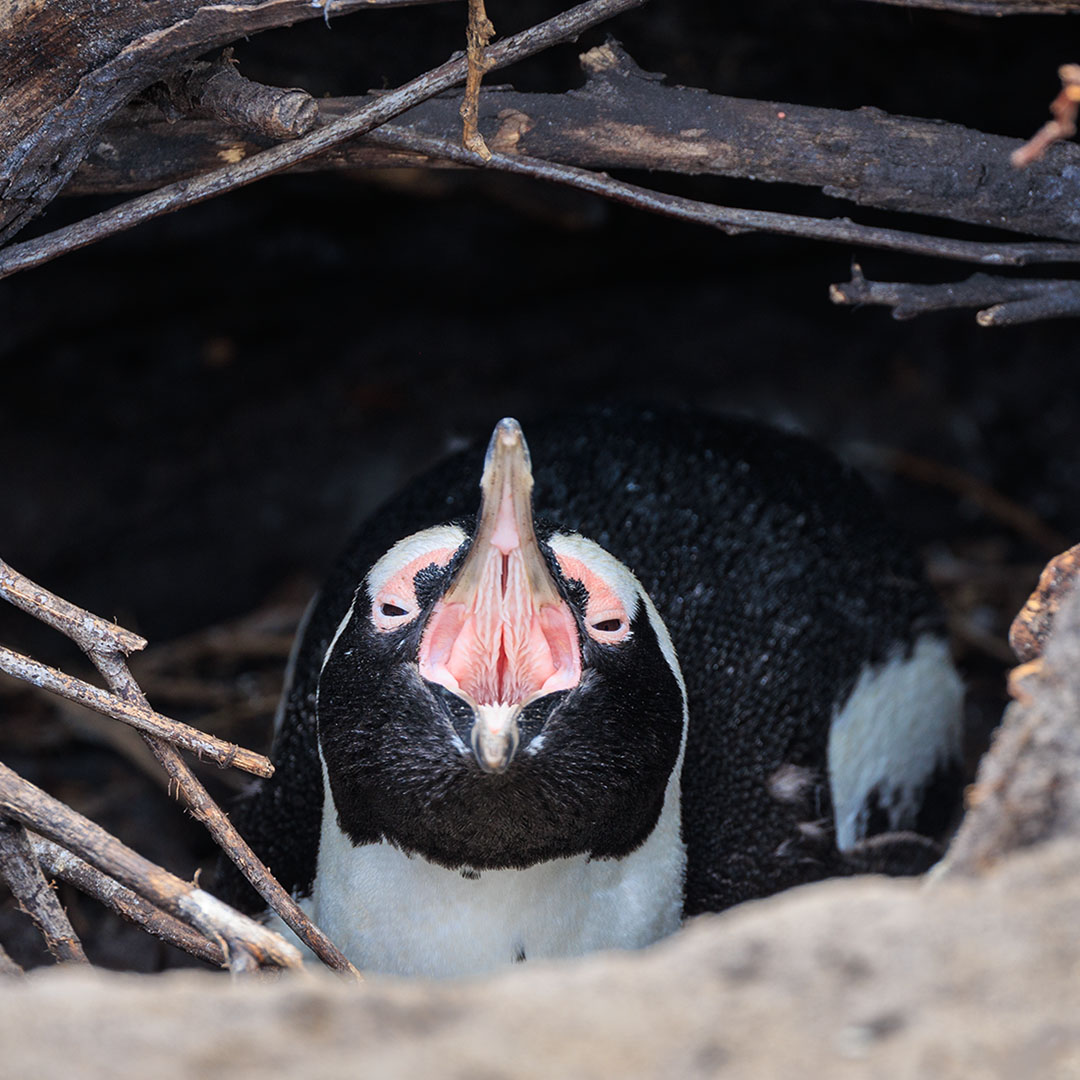
The mouth is pin sharp. The photographer added the surroundings of the nest but in doing that it created a circle around the penguin. This do not add but distract from the scene with the out of focus bottom and pin sharp branches left and at the top. Would suggest removing the top branches with a tighter crop.
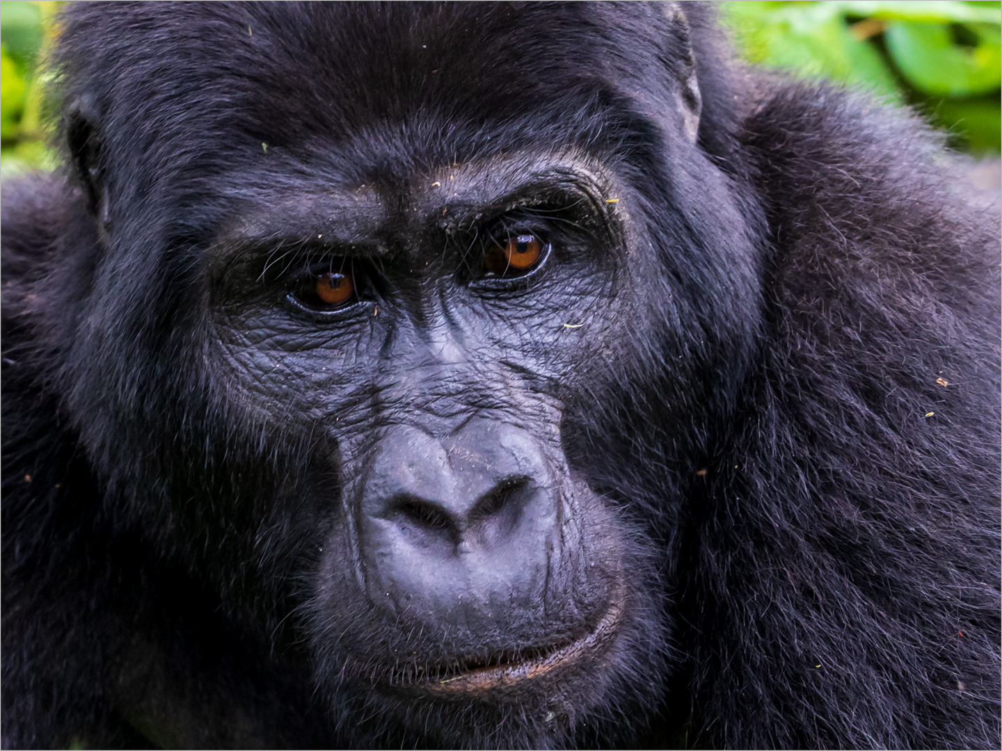
An image not commonly seen. The features are sharp with nice detail throughout. The crop is a bit too tight – especially on the chin. Would like to see a bit more at the bottom.
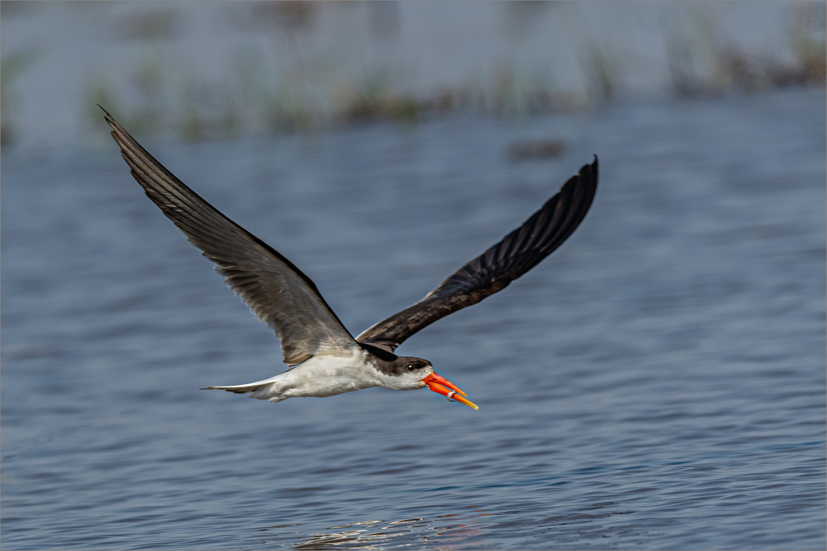
Well seen and taken. The focus is not completely on the eye of the bird which we want to be sharp.
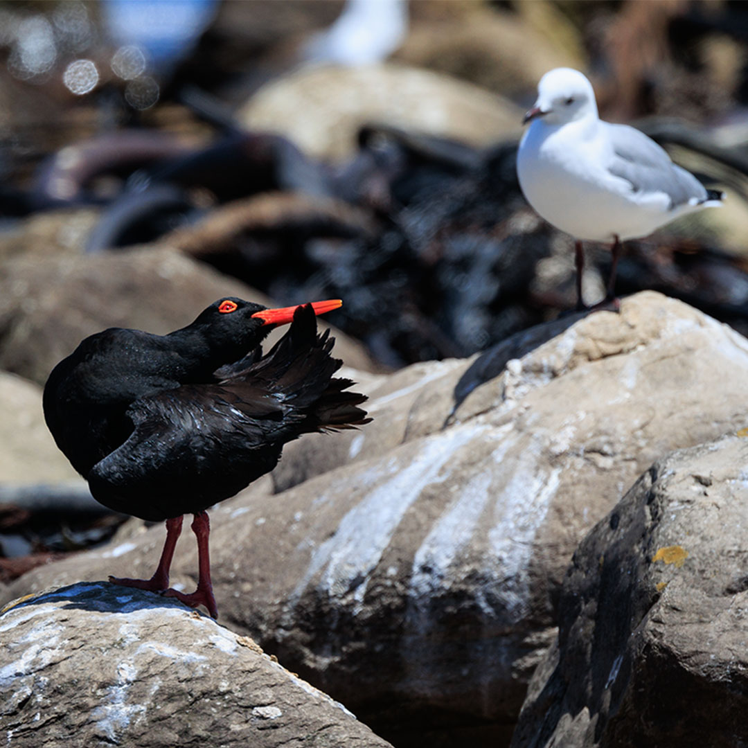
The out of focus white area in the background takes the viewers focal point from the Oyster Catcher to it. If possible – try to crop out the background.
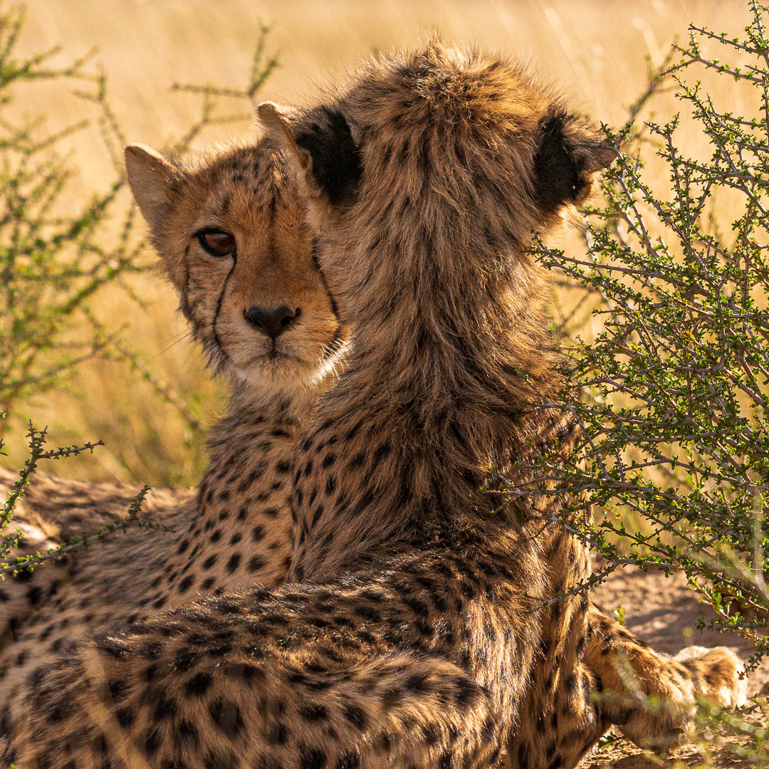
In focus with the surrounding showing – but not distracting. The image would have scored higher if the other eye of the Cheetah cub was also visible.
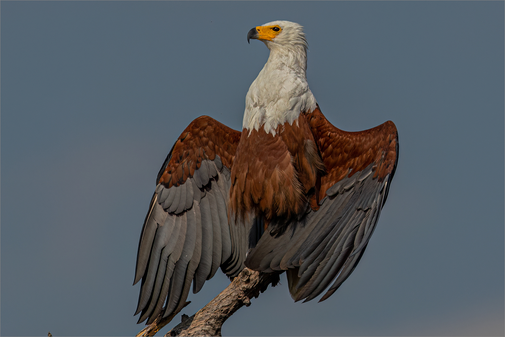
Beautiful pose, well captured. Love the detail in the feathers and on the wings. One does not always see a Fish Eagle flashing.
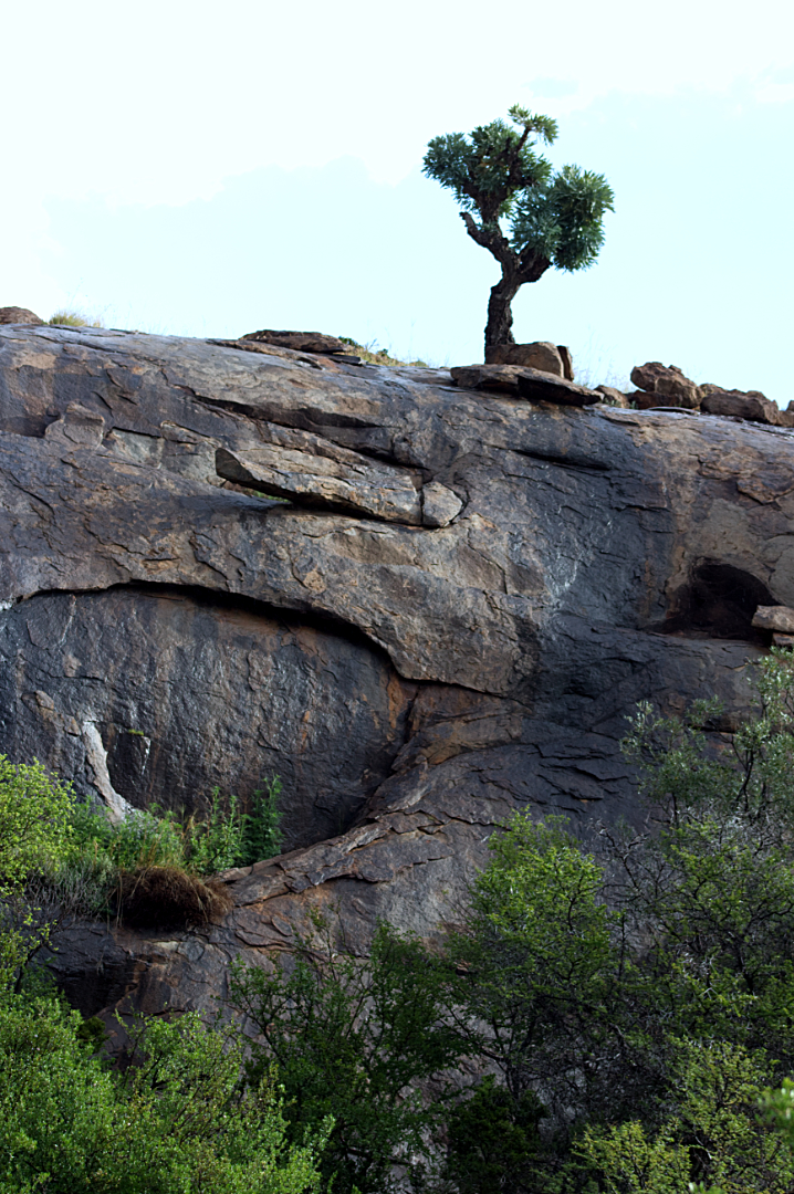
Well seen with a beautiful compostion. By adding the circle in the rock face adds to yout final presentation. The tree a the top is a bit soft and need to be more in focus.
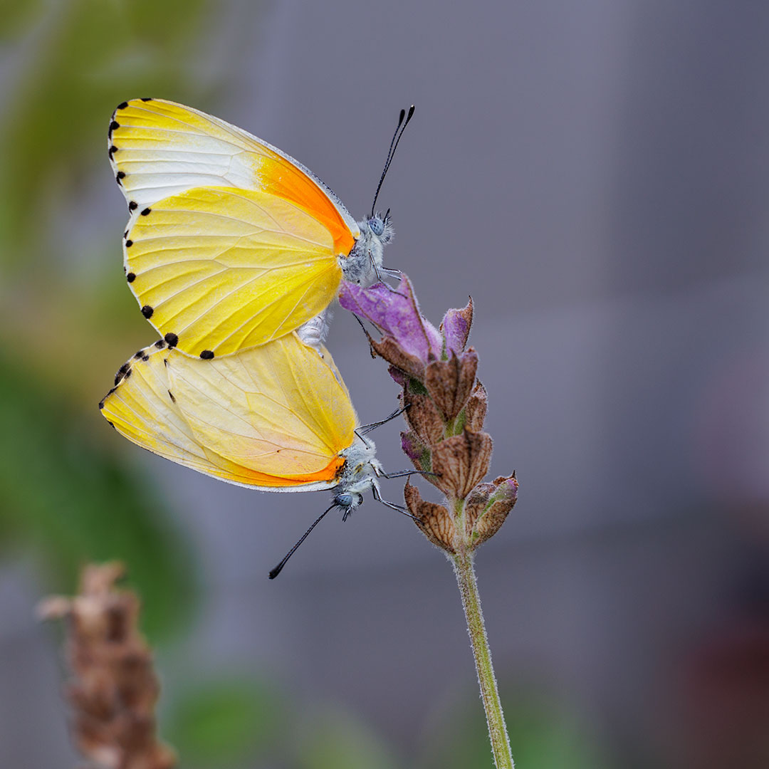
The author successfully got both pin sharp with lovely detail on the wings. If it were in an Open category I would suggest removing the flower in the bottom left.
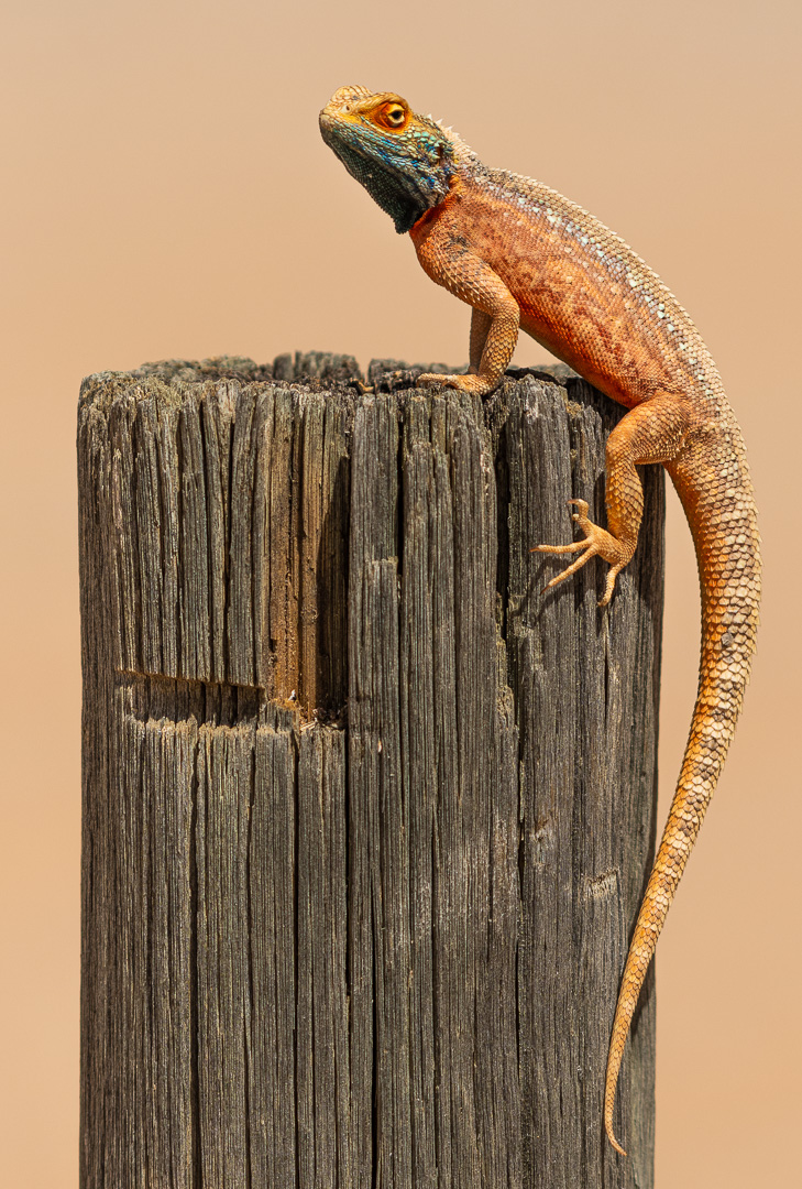
Nice and sharp. Lovely detail visible. Would advise the use of a gradual neutral density filter (post processing) to darken the post in the foreground and using the levels to bring out a bit more colour.
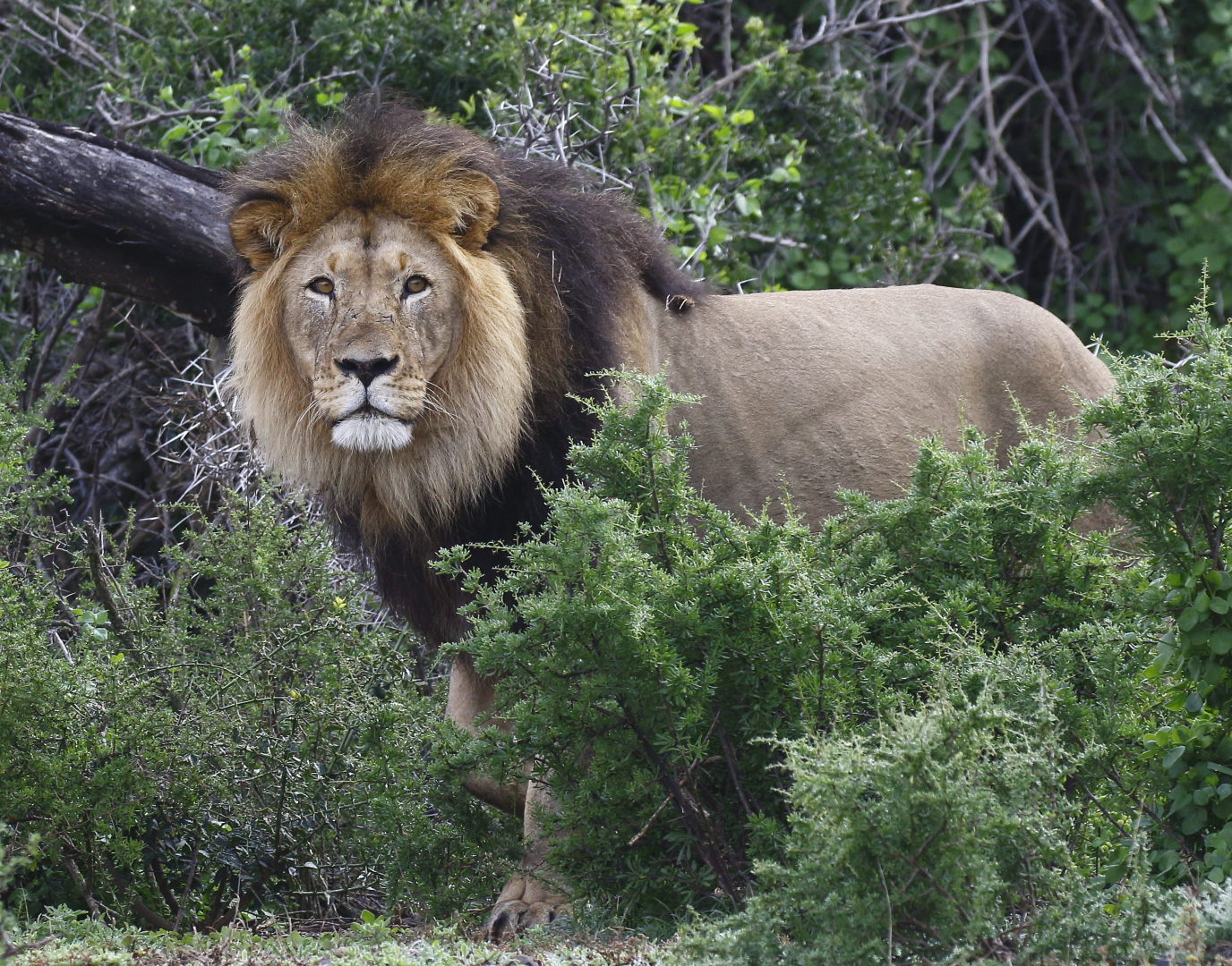
Sharp throughout and lighting handled very well The Lion emerging has enough space to move into. Colours are vibrant but do not interfere with the Lion itself. The Lion’s paw is a bit near at the bottom but there is enough space left by the photographer.
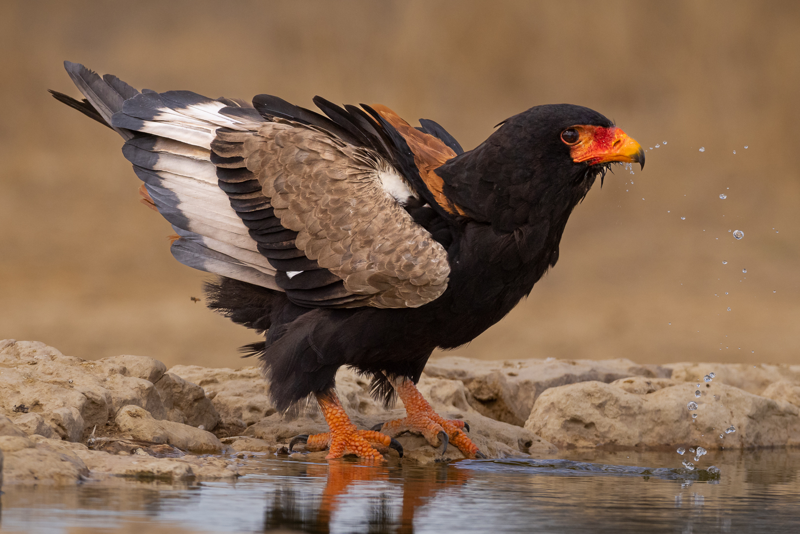
Lighting, sharpness, composition and detail are correct throughout the image. Well done
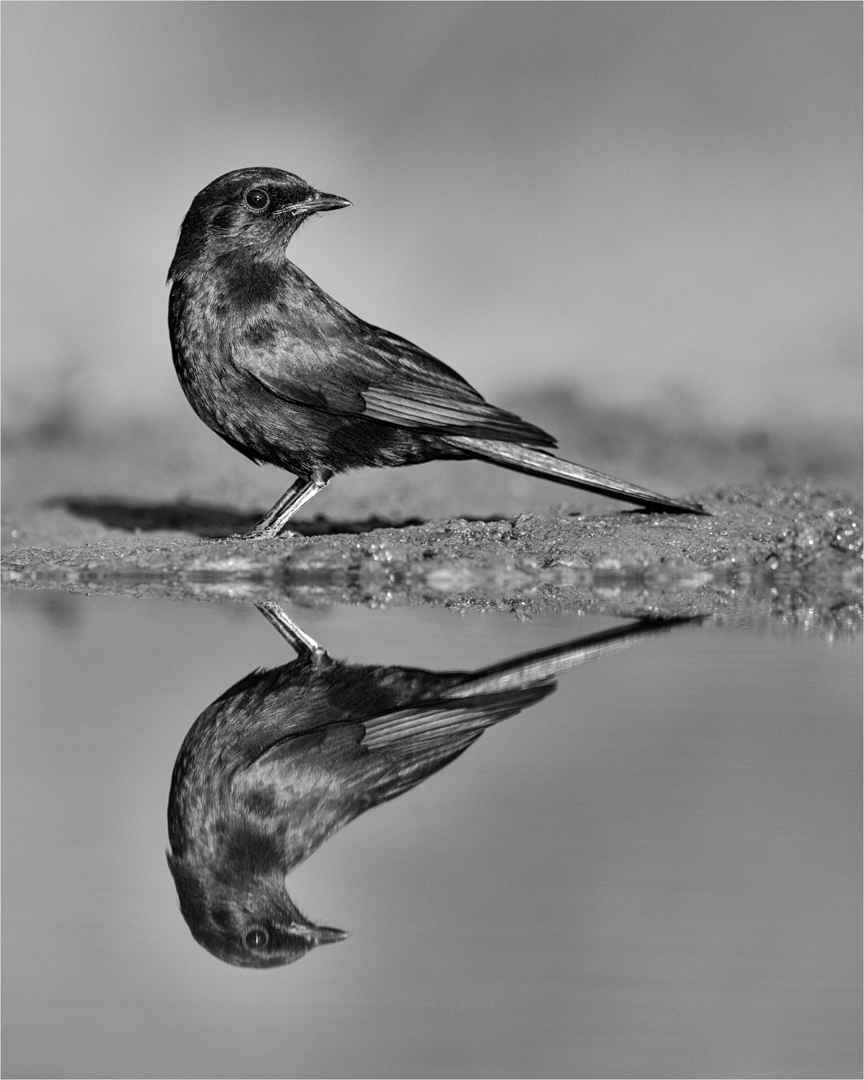
Beautiful detail in both the bird and the reflection. Background that is out of focus add to the finishing of the image to keep all the focus on the bird.

Very good compostion with the herd coming into the image The dust reflection the sun colours add to it. A tighter panorama crop will help this image to stand out more. Crop off just above the trees and a little at the bottom.
OPEN
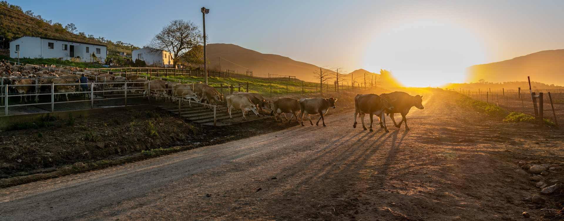
A beautiful farm image with the cows strolling into the road. Composition, crop and overall setup have been handled very well. The only drawback is the burnt out area on the hill where the sun is.
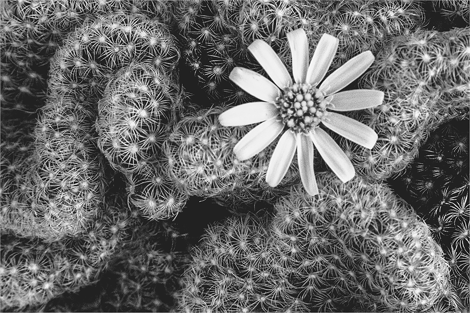
The cactus thorns create a lovely lead in towards the flower. Your focus was supposed to be on the flower and its petals but it is a bit too soft and not in full focus.
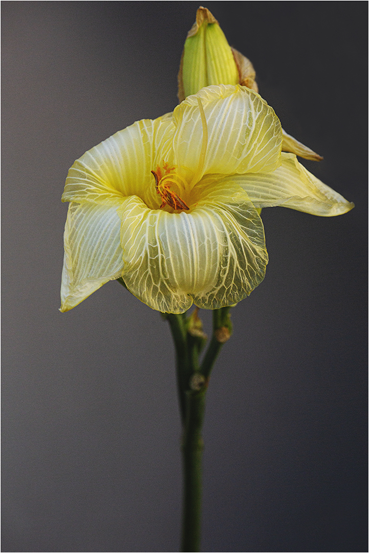
Lovely detail on the flower itself. The bright areas (glare) on the flower could be reduced either in post processing or whilst taking the picture by using a reflector or setting the exposure at minus a third stop. The Focal plane must be correct to bring in focus both the flower and its stem underneath
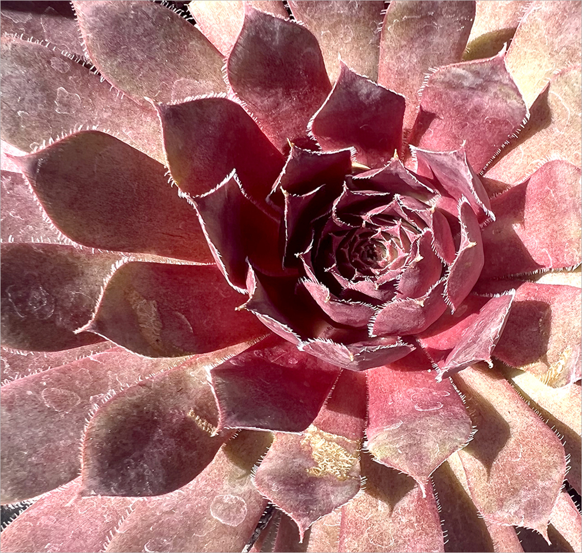
You handled the composition correctly. The over bright leaves at the bottom and right could be subdued if you made use of a Gradual netral density Vignette. With a reflector one could lessen the shadow in the centre to show the intricate patterns better. This a type of image that lends itself very well for conversion into monochrome.
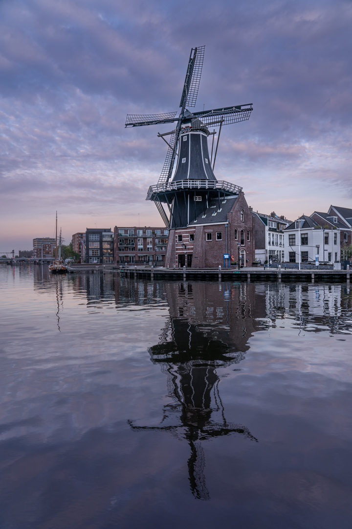
The main focal point here is the windmill and its reflection. One can work on the clouds in post processing to let it stand out more. ( Or use a polarizer when photographing you might get more detail in the cloud). Nice soft lighting on the whole scene. Note: beware of adding too much detail into the clouds. Sometimes too much can also be wrong and make the image appear busy
SCENES
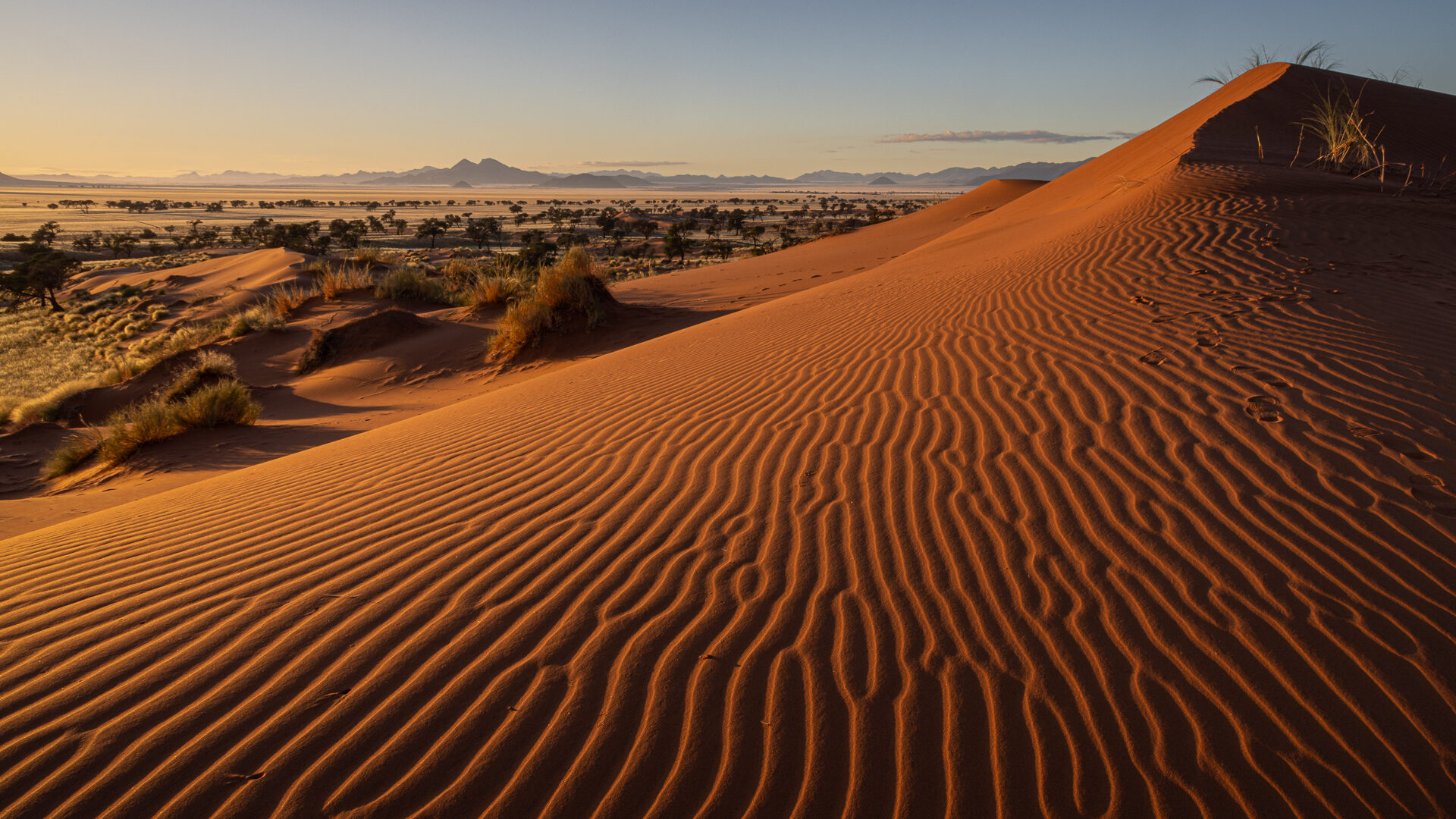
A lovely scape. The patterns in the sand lead the eye into the image towards the top of the dune where the grass is highlighted by the sunrays. Even the tree on the left top.
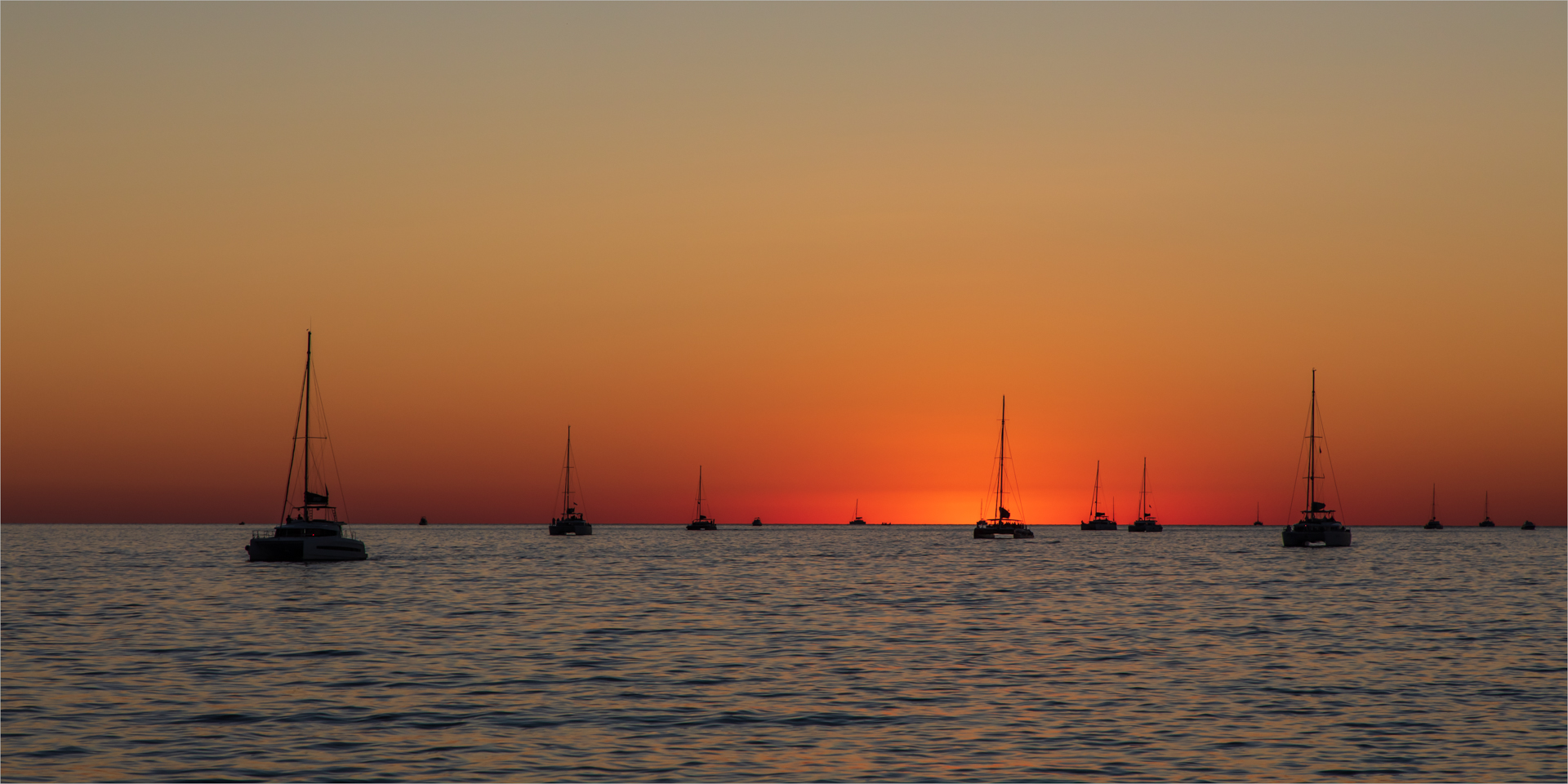
The success of this image is the repetitive patterns of the mastheads of the boats. It is in three groups. The lighting creates a peaceful scene and although it is at places a bit dark there is enough detail visble on the boats.
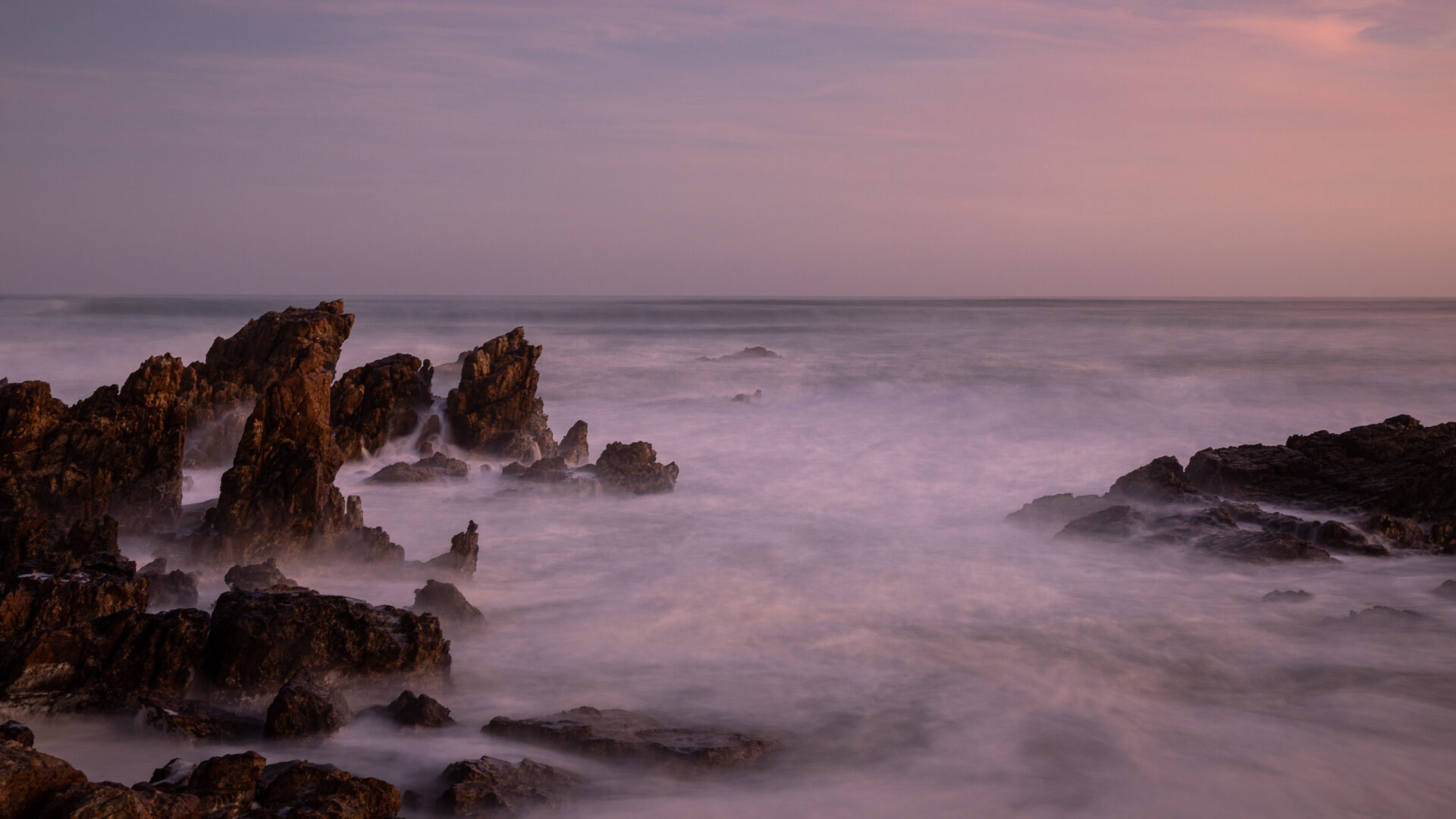
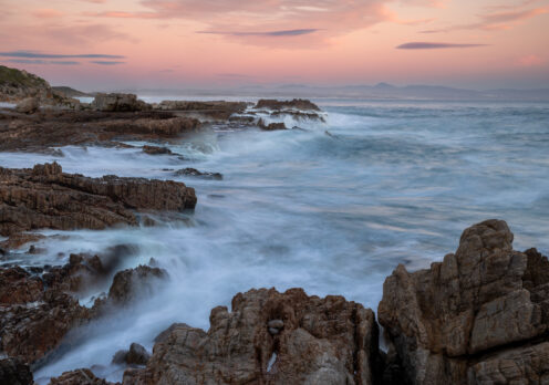
By using long time exposure the photographer created a pleasing scene of this seascape. With the rocks on the left it forces the view into the image with rocks just visible in the distance.Th rock on the right prevent the viewer from leaving the view. A small little tint by working on the levels will bring out more detail in the misty effect on the ocean.
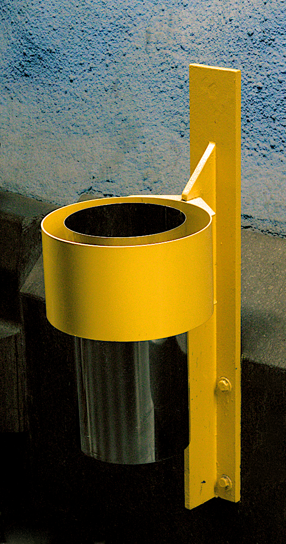
Simplicity in the composition ensures success in an image. The yellow stands out and command attention. The chrome dustbin add to it and the two together stand out against the roughness of the wall behind it.
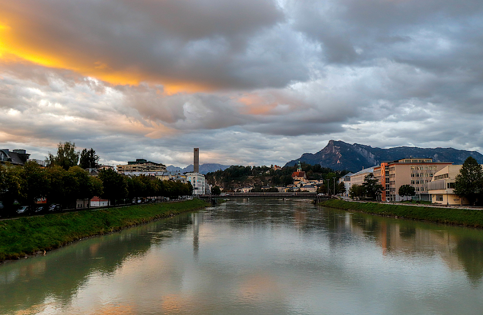
The river becomes the lead in towards the centre and Salzburg. Lovely detail on the riverbanks and in the buildings and background. Normally the reflection in an image is darker than the sky and here it is the opposite. Suggest a tone down in exposure on the river with a bit more detail in the clouds This could become a stunning landscape.
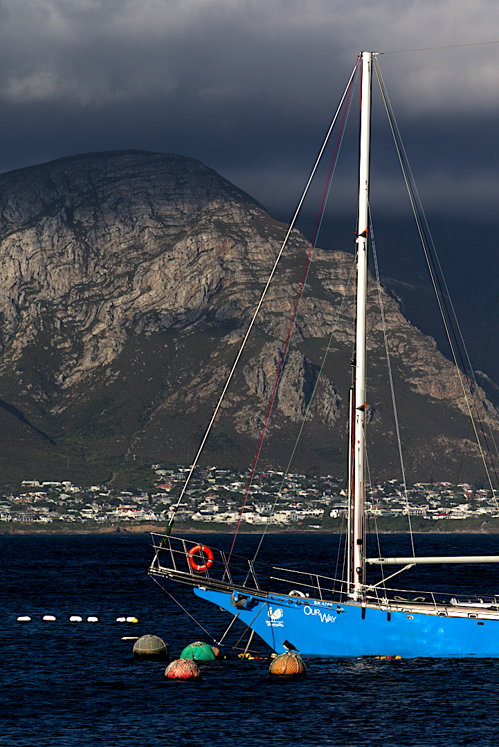
Beautiful lighting on the shore and the mountain. The lighting on the boat and buoys create a lovely frontal focus point. If the scene permitted it, it would be better to have in the whole of the boat instead of halve of it.
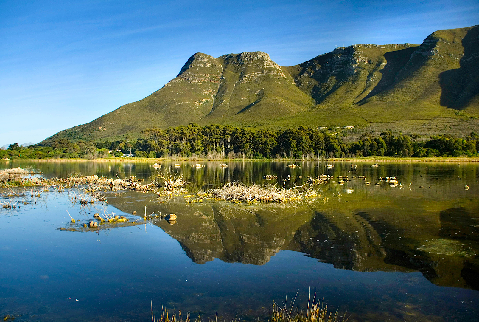
A lovely image of the Salt pan. The question always remain to leave in/ exclude the grass at the bottom. By adding it here helped to create a base on the image. The composition is well handled. To better this image try to darken the lighter area (right) to balance out the exposure overall.
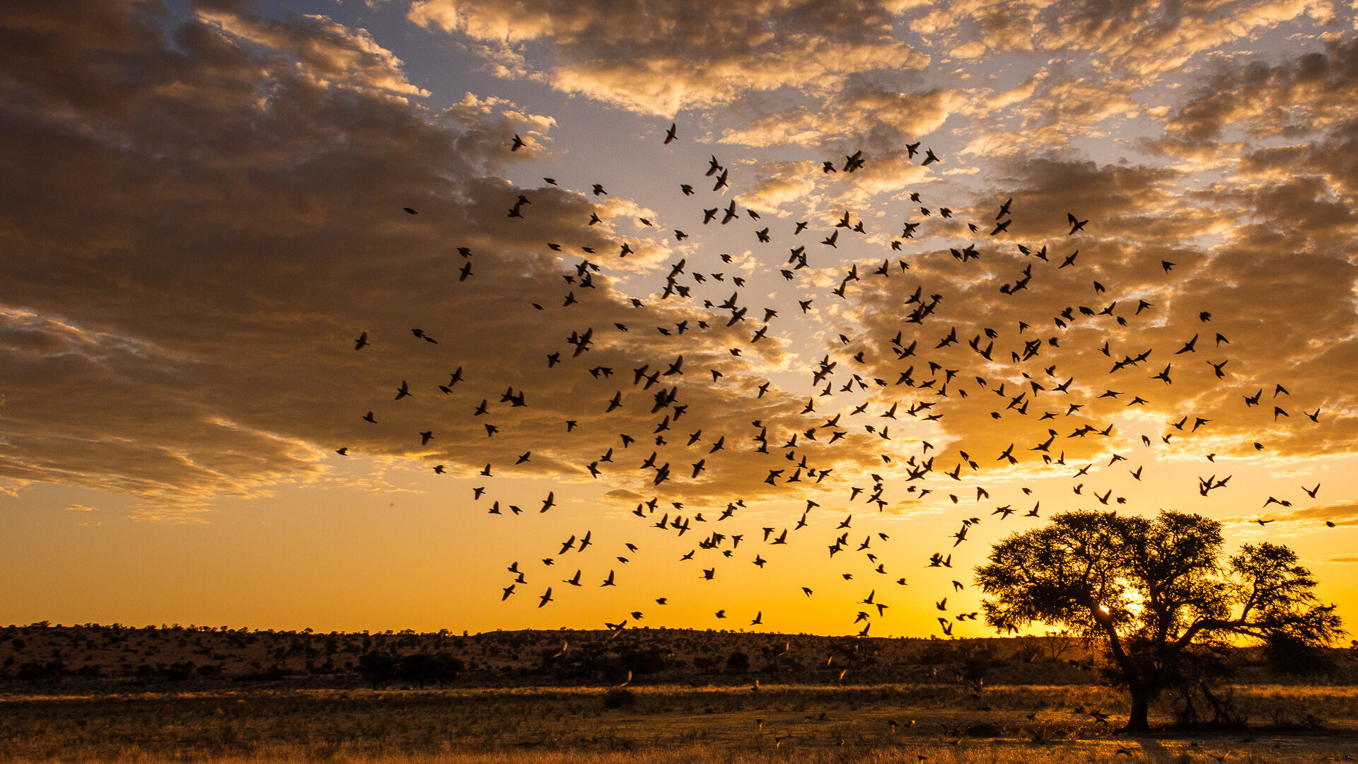
The birds are a huge pluspoint in this sunset. Without the birds it already is a good image with the sun put behind the tree. The lighting on the veld and clouds is correct. The birds flying in add to the drama a little more work on the clouds to bring out more detail will definitely help this image.
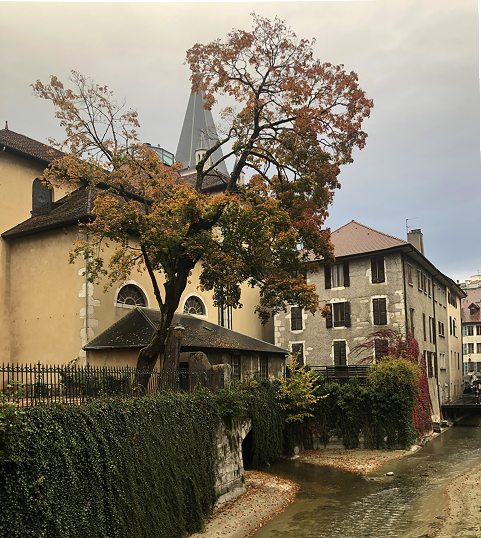
A beautiful urban scape with the old buildings and the water in the street. The tree is towering over it as a guardian. This a very pleasing shot but needs a bit more contrast to bring it to its right. A bit more sharpness on the tree would help a lot. ( I wonder how it would have looked if the phorgrapher went low and shot the scene upwards. That would have reduced the tower behind the tree and the separation between the tree and he buildings could have created a better scene.)
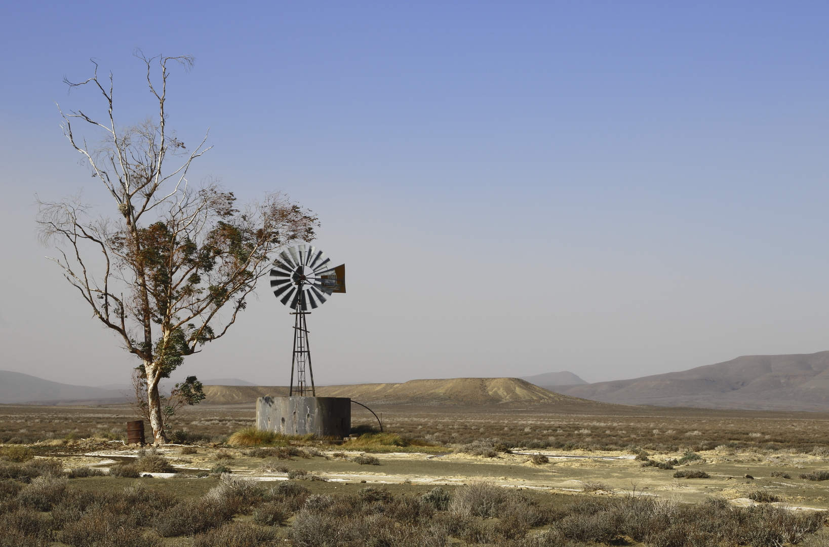
The title and the scene is one. The Windpomp and dam is a stark reminder of man in the widerness. The wide open spaces is inviting and well portraited. The composition with the tree is correct. The hazy view is due to the weather of the Karoo. To better this image I advise the use of using the clarity tool to bring out detail in the background and the ground areas.

A very pleasing scene with the mist covering the valley with the houses just visible nearby. Lovely composition. The strong morning light from the left is too harsh. If it could be toned down to bring in a little more detail into the mountain it would enhance the image.
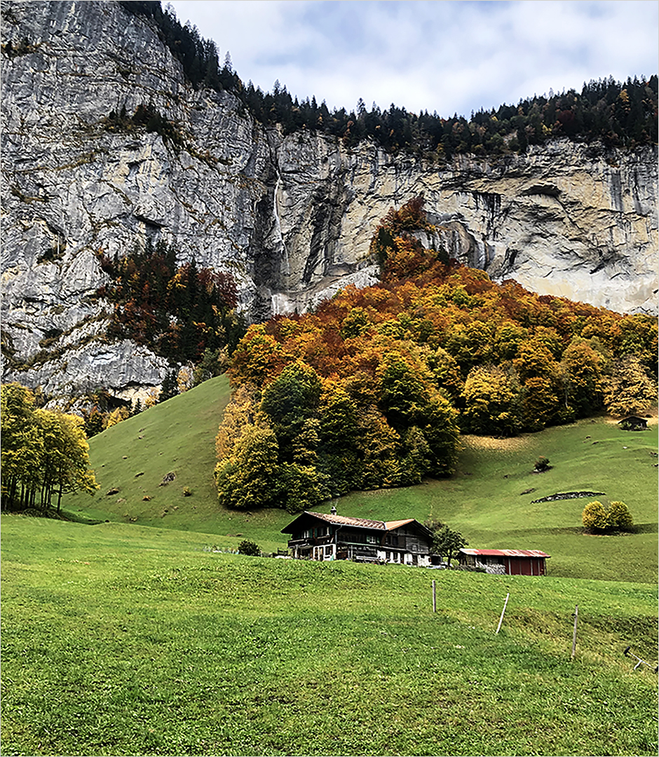
Indeed the 1980’s choclate box effect. The lead in towards the house with the fence together with the triangles created by the hills and the cliffs make this a beautiful compostion.
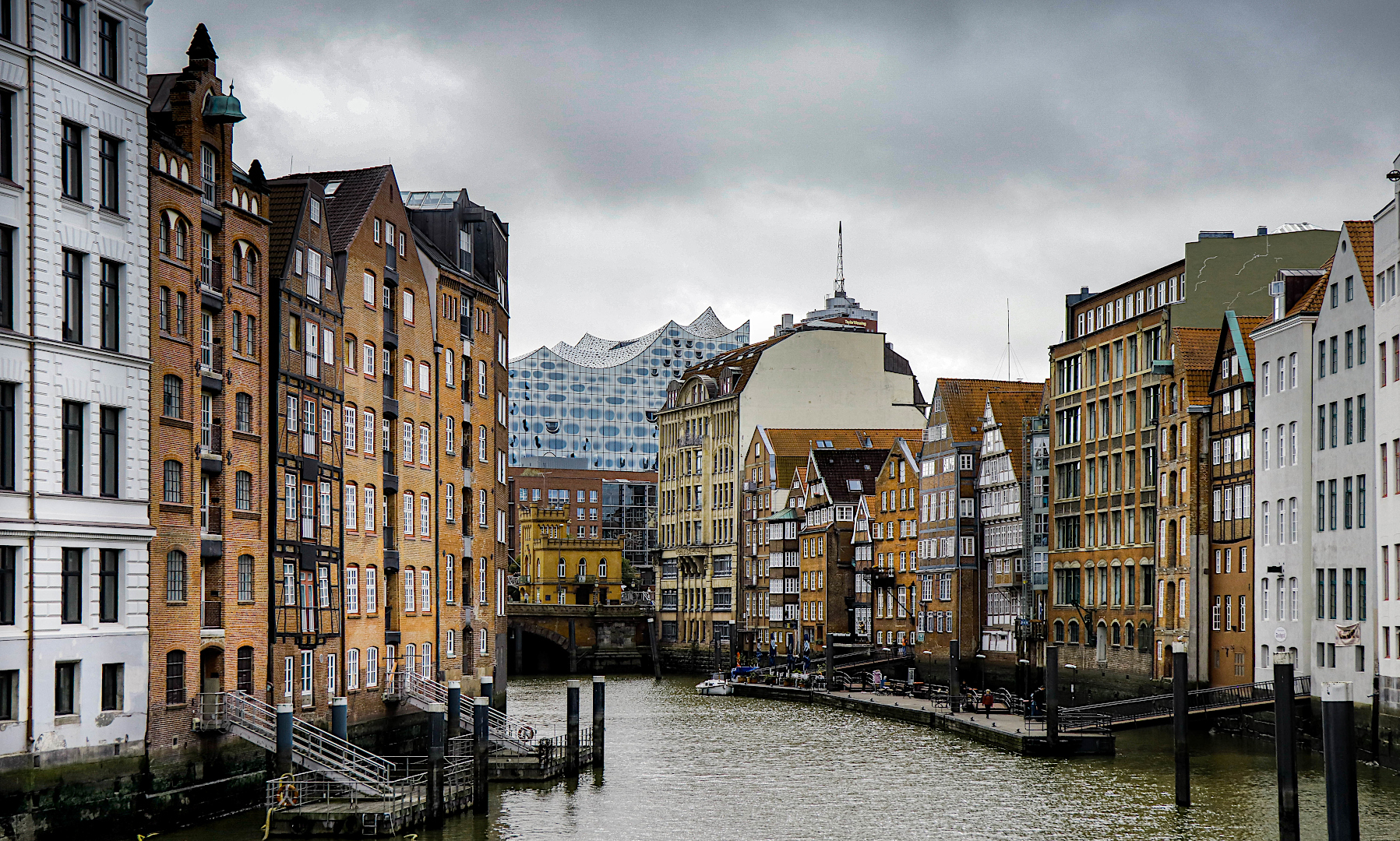
A lovely lead in between the buildings to the modern architecture. Lovely lighting detail and composition. All the image need is a little up in the colours to make it pop.
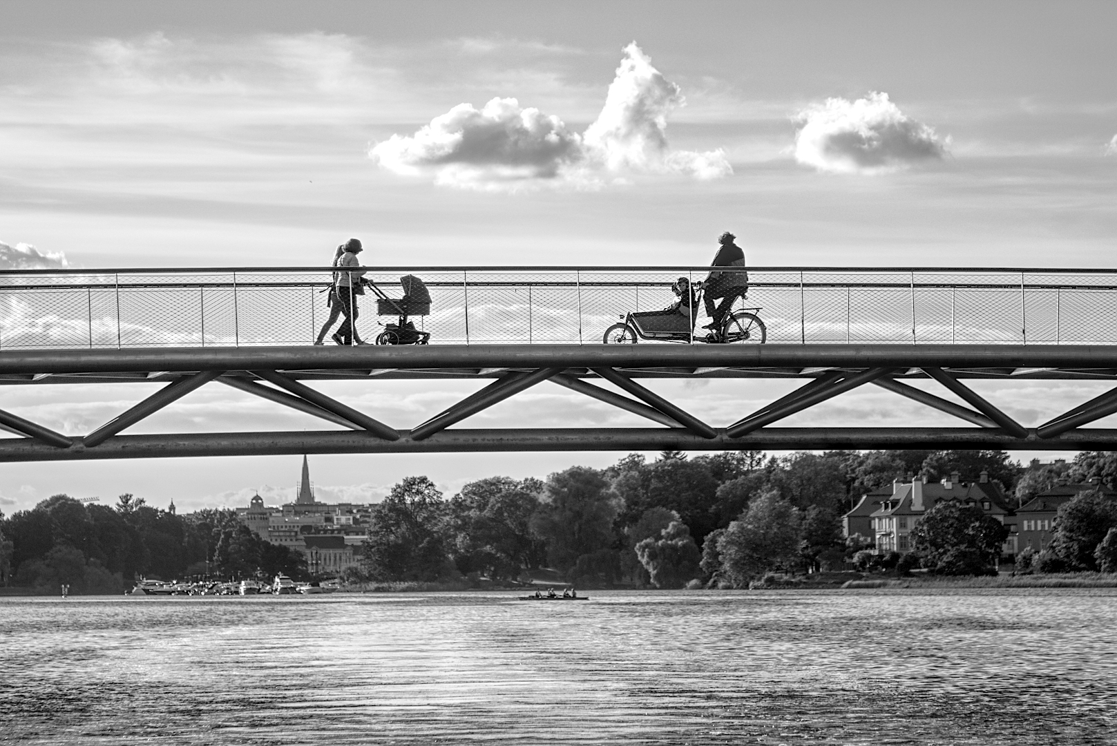
Here we have an image that can be viewed in two. The bottom part and the top halve. The focusing point differ from the people on the bridge and the boats on the shoreline. If the bottom halve were darker the focus would stay on the people on the bridge.
SET SUBJECT: A LOCAL IMAGE
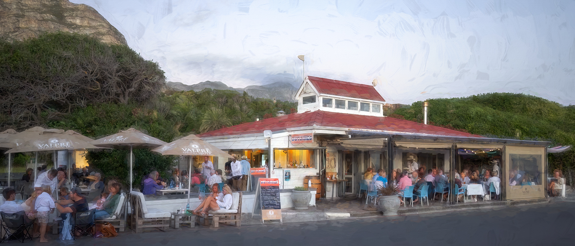
The effect created here is very pleasing and restful. The colours and lighting are well handled. The image have a lot of interesting points that draws the eye. To better I would suggest the removal of the group on the left with the umbtrella as part of the border.
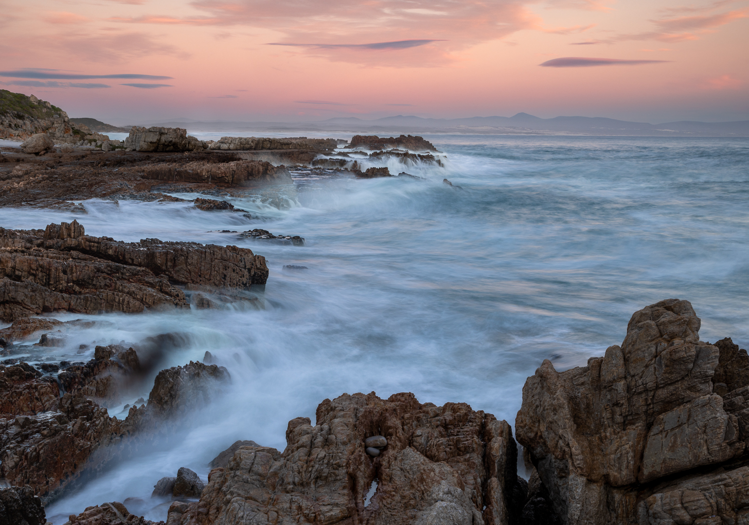
Last light at Kwaaiwater © Phil Sturgess, MS, 27, Merit
Now this is a kwaai image. Everything wanted in a beautiful scape. Well done.
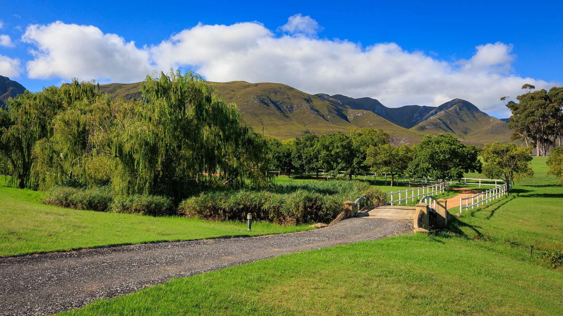
Nice lead in from the left over the bridge. A very restfull scene, well composed and the lighting is handled well. If there were a focus point on the road at the bridge or before the bend i.e a dog, animal or someone walking it would score higher.
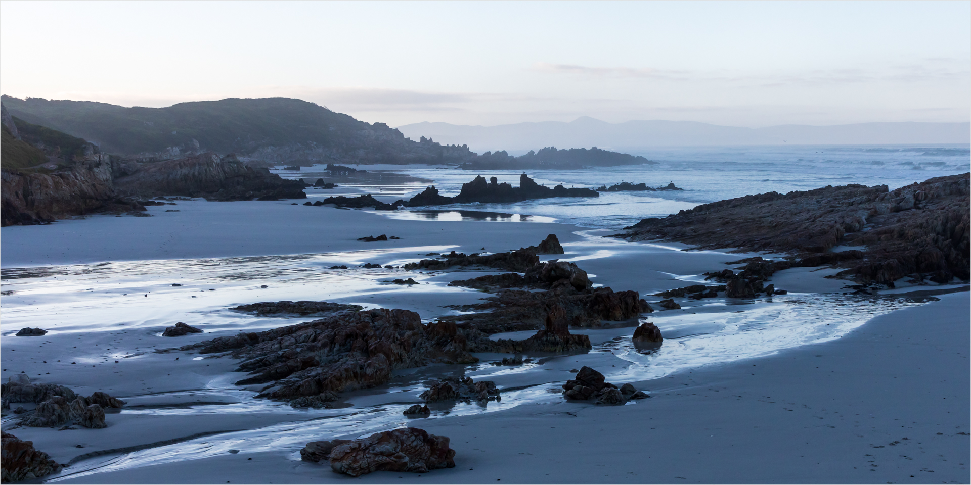
A beautiful scene with great possibilities. The lighting is a bit flat on the colour image. This image will lookstunning in HDR or in monochrome with low key effect to bring out the reflection on the wet sand with the stark contrast of the black rocks.
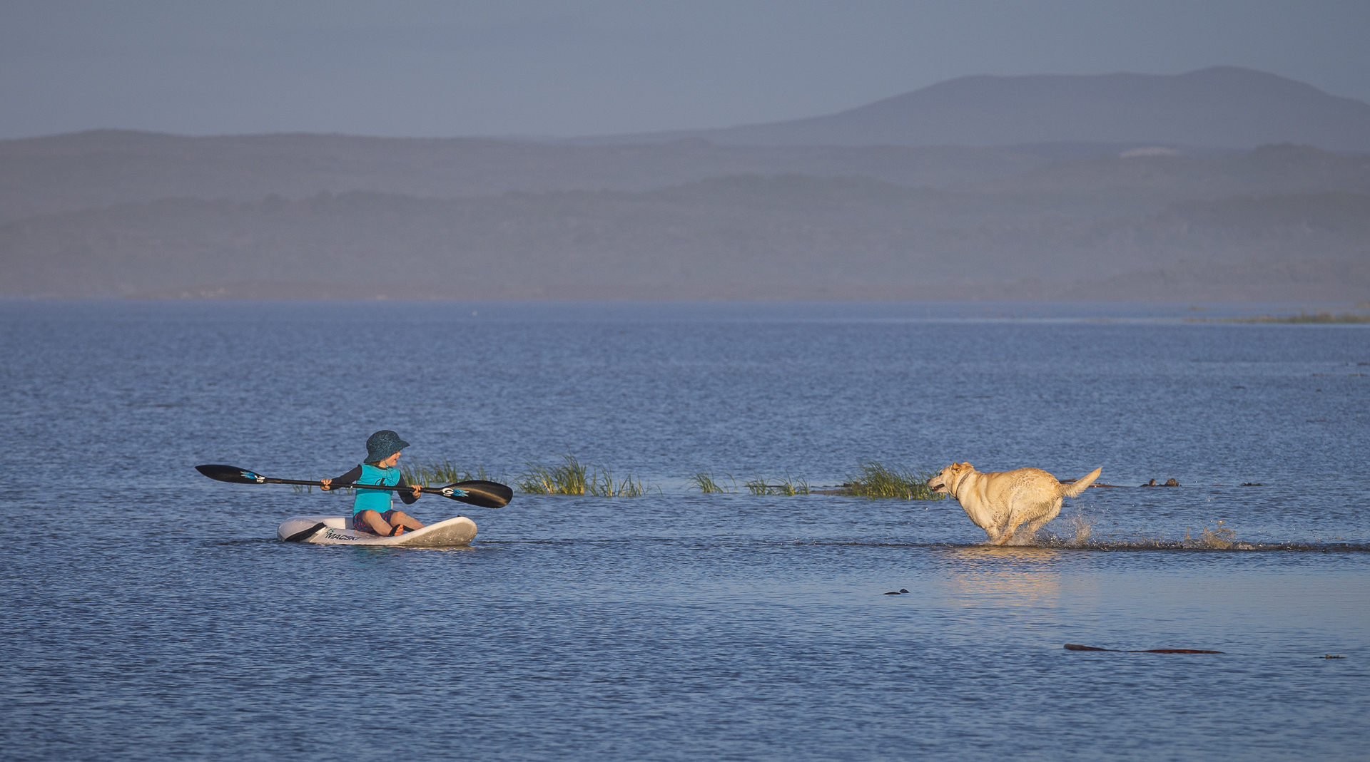
Those happy moments caught on camera. Lovely composed and sharp. A little bit more detail in the background would make it beautiful.
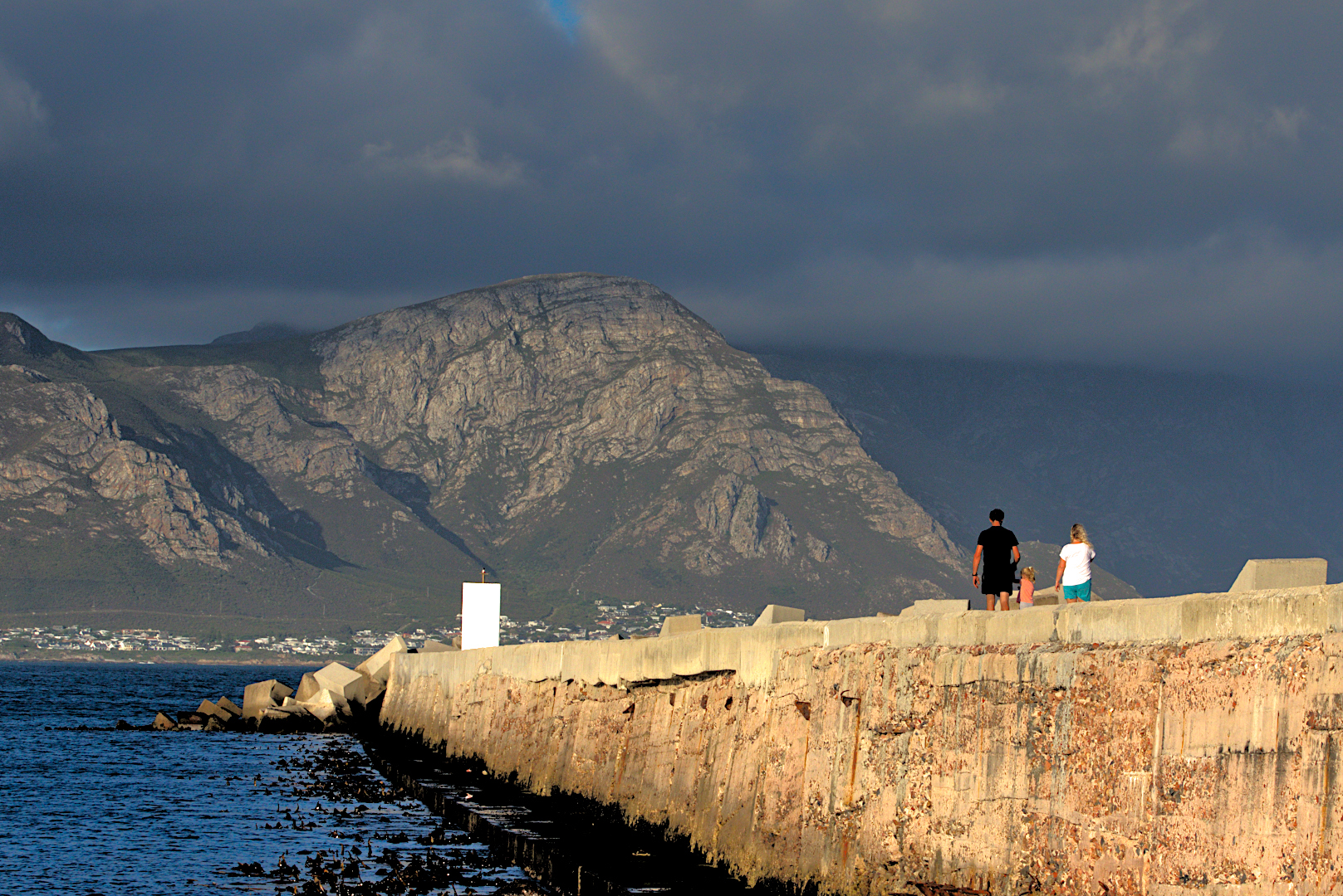
Lovely detail on the mountain in the background. The light on the side of the pier is a bit too bright and prevent the viewer from looking further. The tower at the end is burnt out in the bright sunlight.
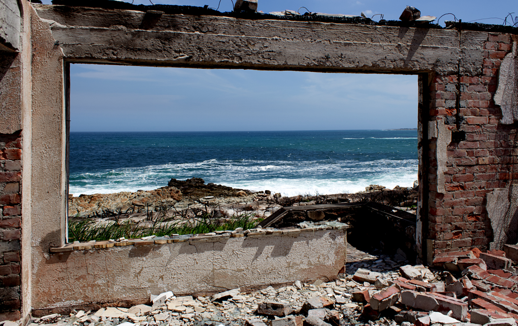
Very interesting viewpoint. The ruins create its own border for the view. The rubble on the inside is a bit distracting. If the photographer stepped (if possible) one metre to his/her right some of the foreground could be eliminated to show the ocean view only with the old doorway as lead out towards it.
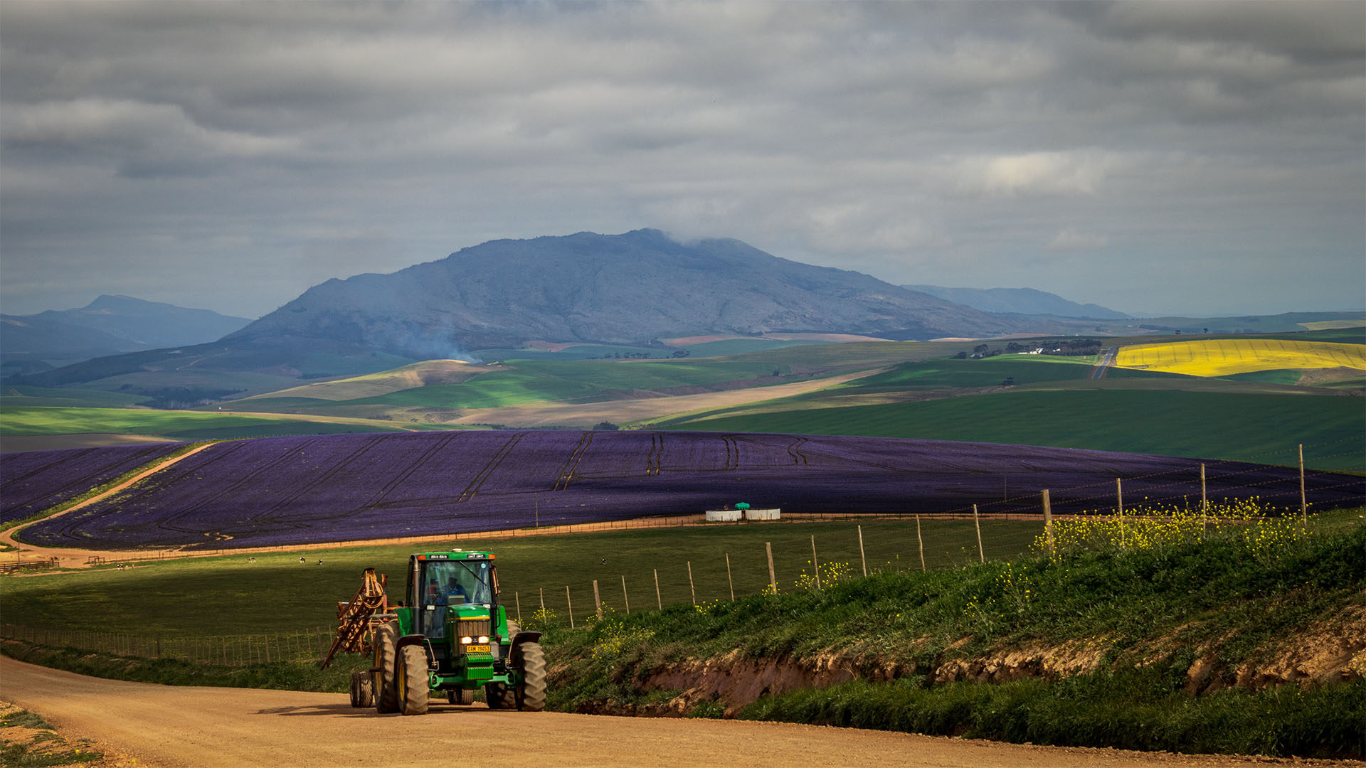
Very intriguing. The different colours in the landscape which all stand out in the sunspots. The roads creating lead in lines. The tractor, dam and buildings creating scale and giving depth to the image. The purple is the sharpest and draws the most attention. One can look at this and see a different story each time when passing it. Lovely moods.
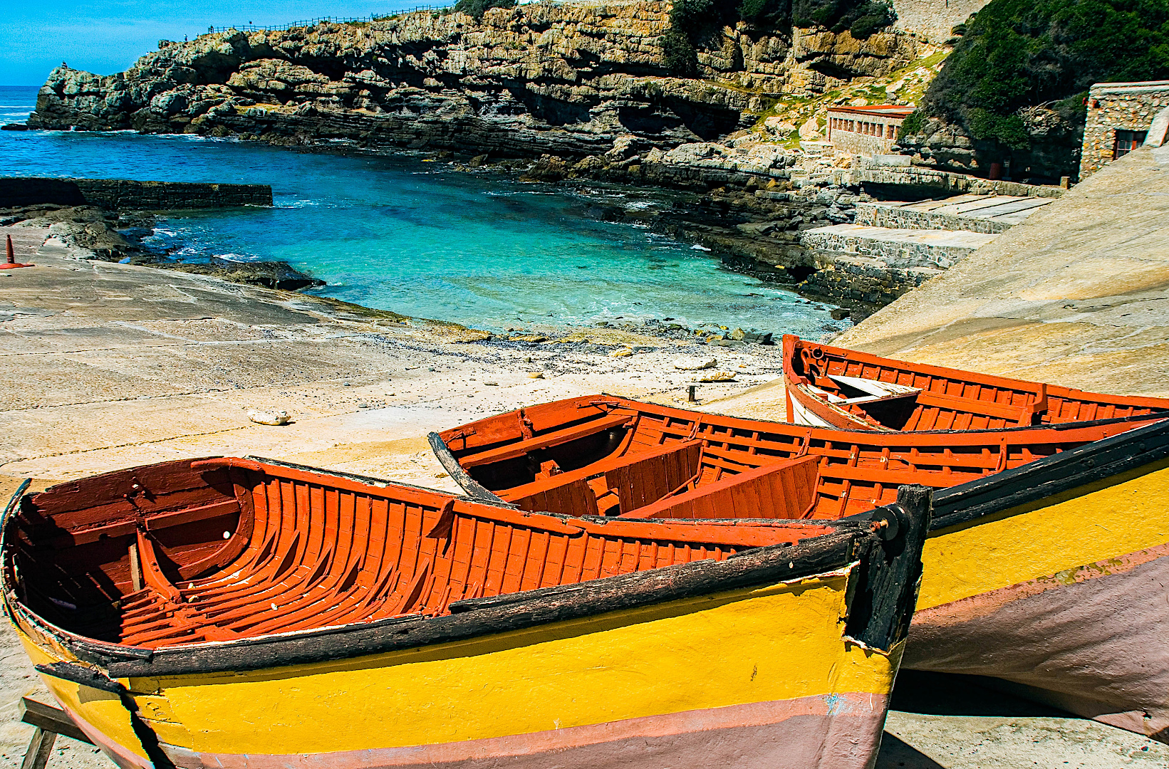
Lovely scene. The only problem here is the cut off boats in the foreground. They are also too huge and block the view into the harbour.
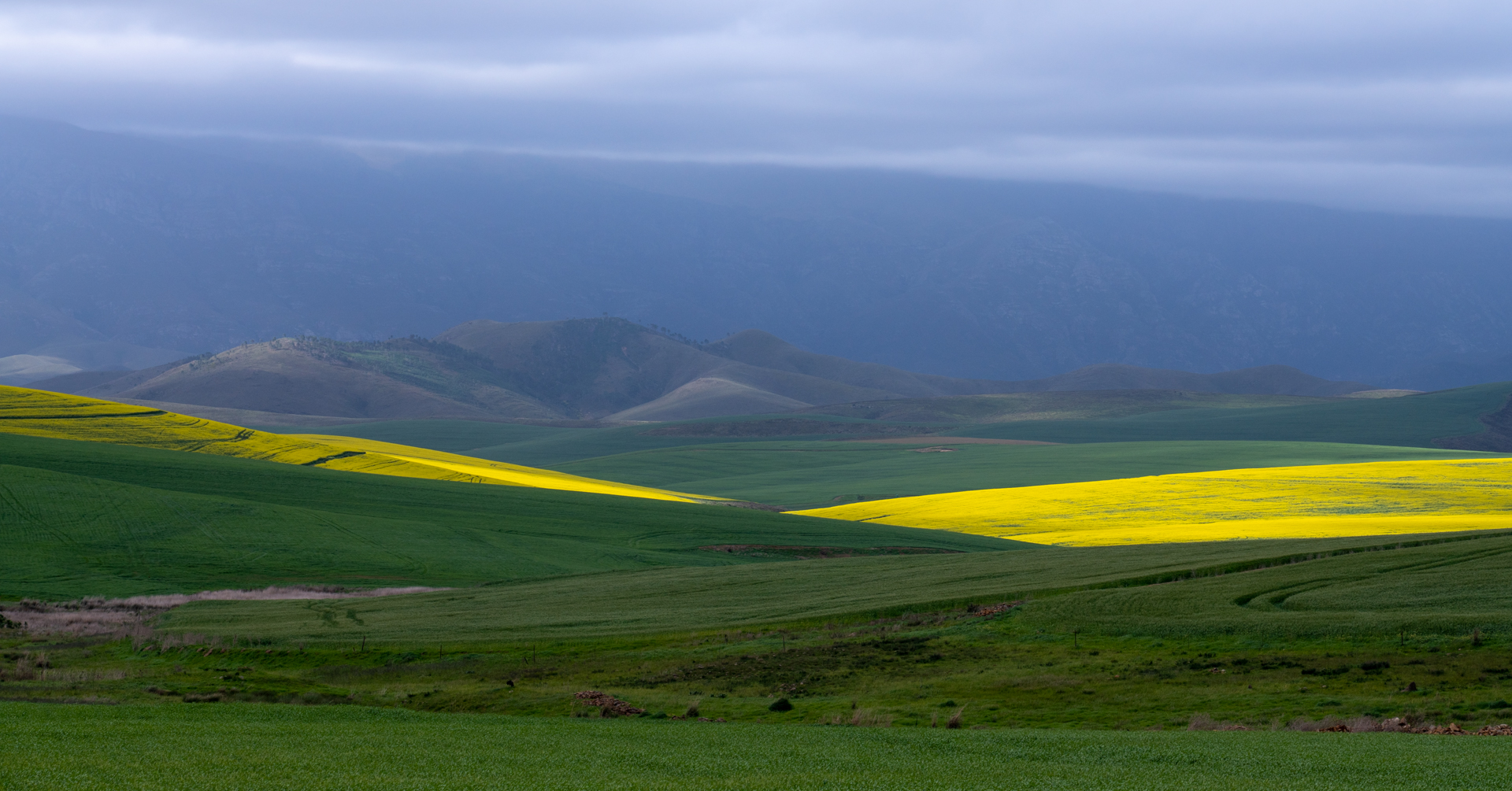
The sunlight breaking through creates a stunner. Would suggest a thinner foreground or a thin panorama to concentrate on the Canola only.
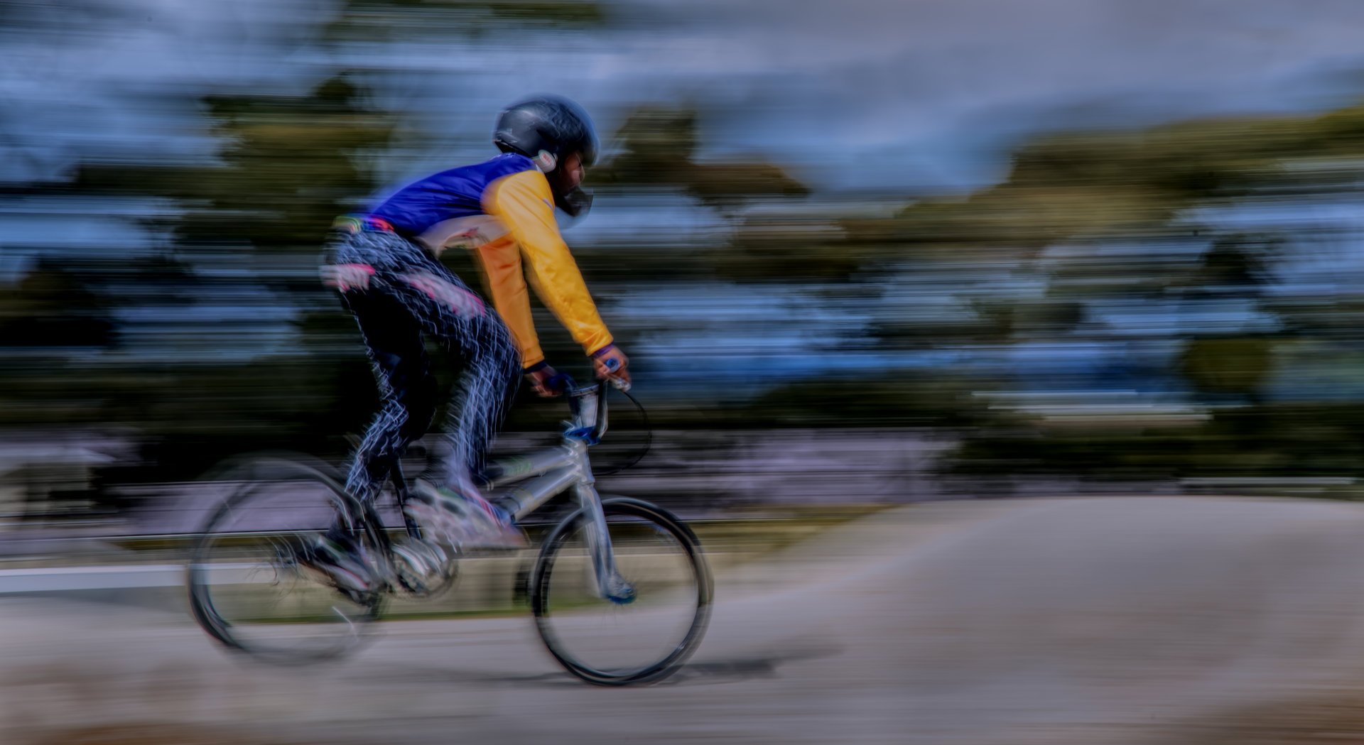
Visual art and movement combined. Lovely colours and composition.
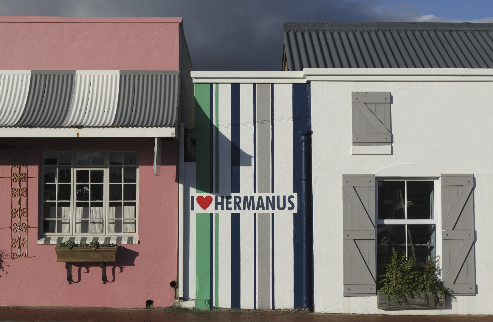
I love Hermanus © Ingrid Grundlingh, 3*, 24 Gold
Everything needed to make the image successful is present. Colour to capture attention, shapes and patterns. Simplicity of the setup and in full focus with soft lighting.
