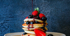
The Set Subject for December was Food Photography and club members excelled in showing off their culinary expertise and photographs. The winning image was Berries and Pancakes by a junior photographer, Mari Botes. It scored a whopping 27 out of 30. Comments on the images below are by Phil Sturgess and Carina de Klerk, while Charles judged their entries.
Judges: Carina de Klerk, Phil Sturgess and Charles Naude
Set subject: Food and Drink
This is a really well visualised and creative image, involving a successful partnership – the spoon holder and the photographer. The spoon dripping compote adds a dynamic element to a static table-top image. The repetition of shapes (plate and pancakes) works well and the red and black colours add impact. You just want to eat this up! It’s possible that a slightly darker background would add further impact and make the pancakes and berries pop. There may be some loss of detail in the red channel, but its outstanding as presented. Well done! 27, Merit.
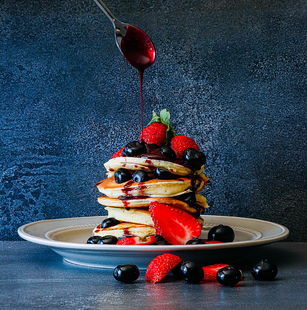
Overall a reasonably well composed and created image. Vibrant colours and the freshness of the food makes it quite enticing. The circular black plate also contributes to the visual impact, complemented by the circular flower and slices of cucumber. However the table top and specially the variable light in each of the corners of the image is a distraction as is the crisp / bread at the top of the image. The plate may also be a little too busy or could have done with less food. 23, Silver.
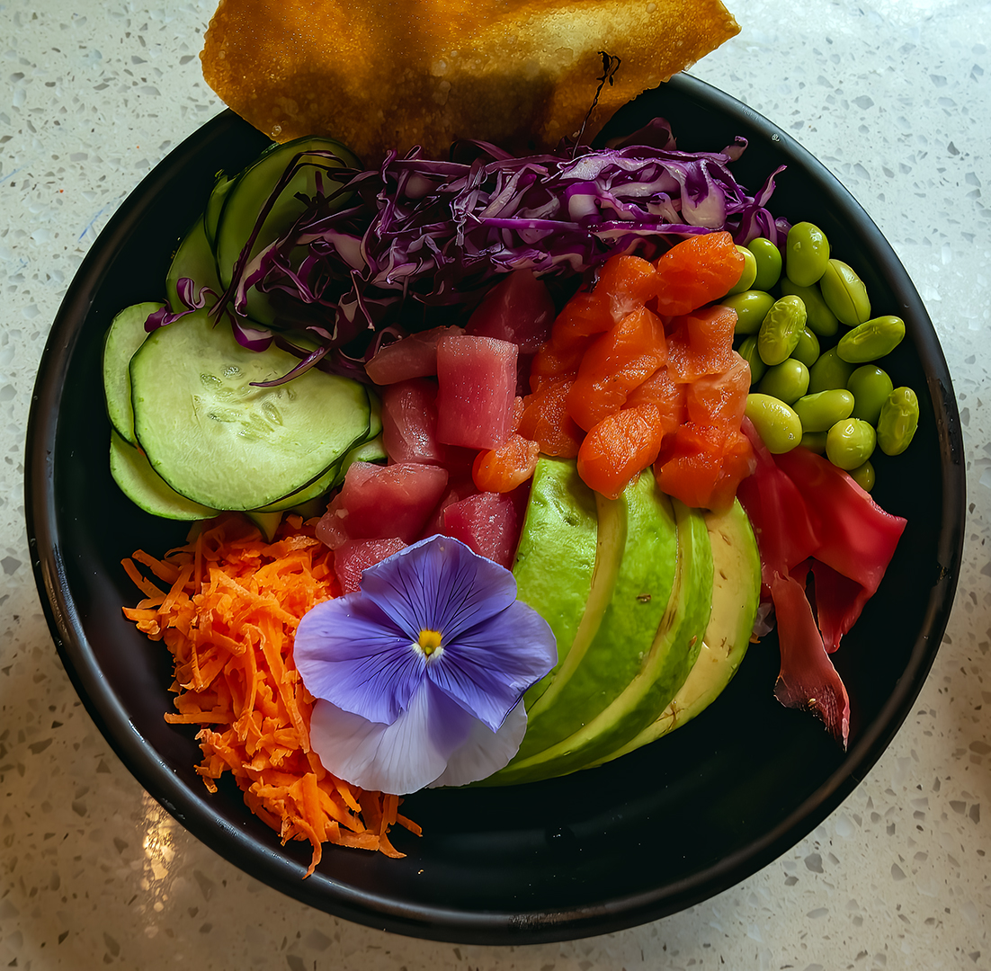
This still life works well. The white cup and saucer right in the centre form a strong focal point, which could have been overwhelming. But a balance was created, and the whole picture was enhanced, by the well arranged skuinskoek, konfyt, and other edible and/or decorative objects, all in autumnal hues. Well positioned lighting add sparkle. 24, Gold.
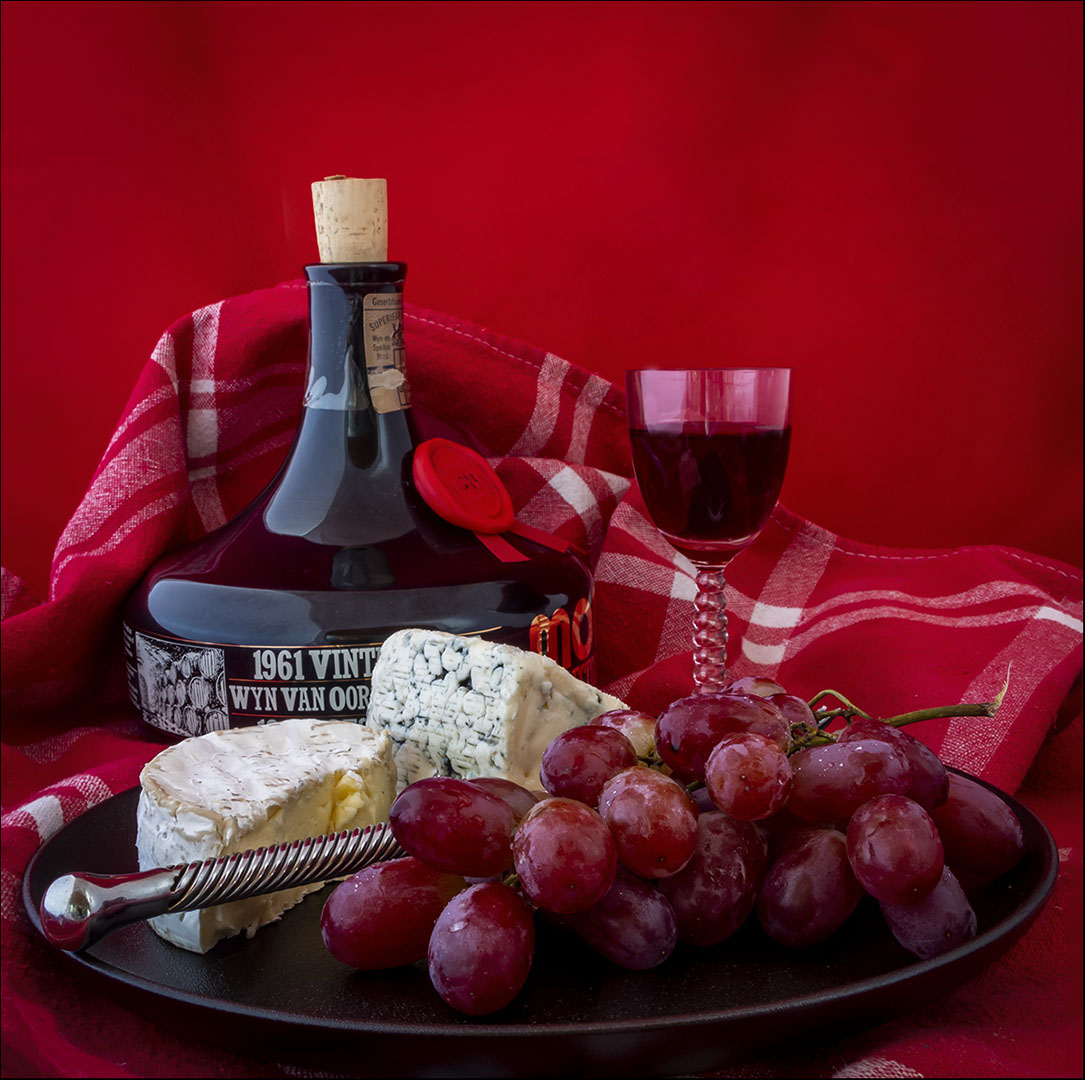
Strong and enticing image, the warm colours adding to its appeal. The lead-in from the silver cheese knife and the contrast between the red hues and the blue veined cheese also works well. It can be further improved by darkening the cork, which looks new and out of keeping with the 1961 vintage, and a couple of the minor peripheral highlights. 26, Merit.
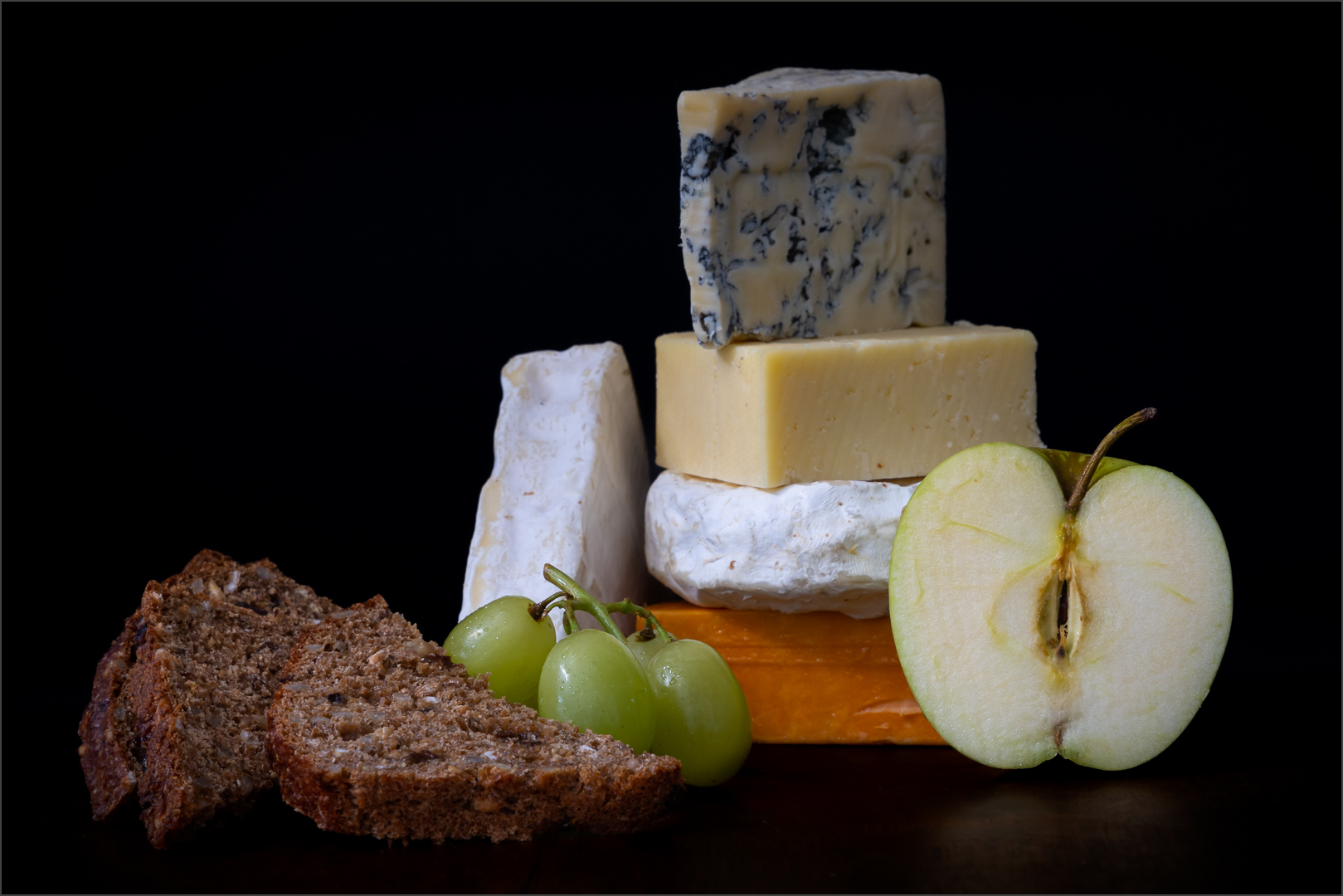
The soft lighting and the combination of colours add some mood to this still life, and the sliced bread looks tasty and inviting. But the apple doesn’t look fresh, and the arrangement of the cheeses doesn’t contribute much to make the presentation as a whole attractive. 20, Silver.
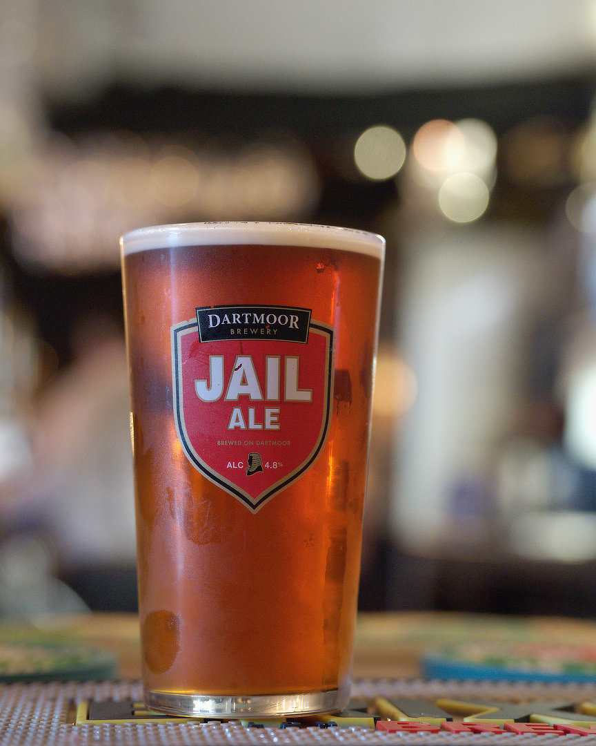
The bokeh flares in the background works well and tells more of the environment. But, as a food and drinks image it is not particularly appealing. The ale looks a little flat and while the glass is chilled the finger prints are a distraction.That is why food photography is not easy and takes many shots to work. 21, Silver.
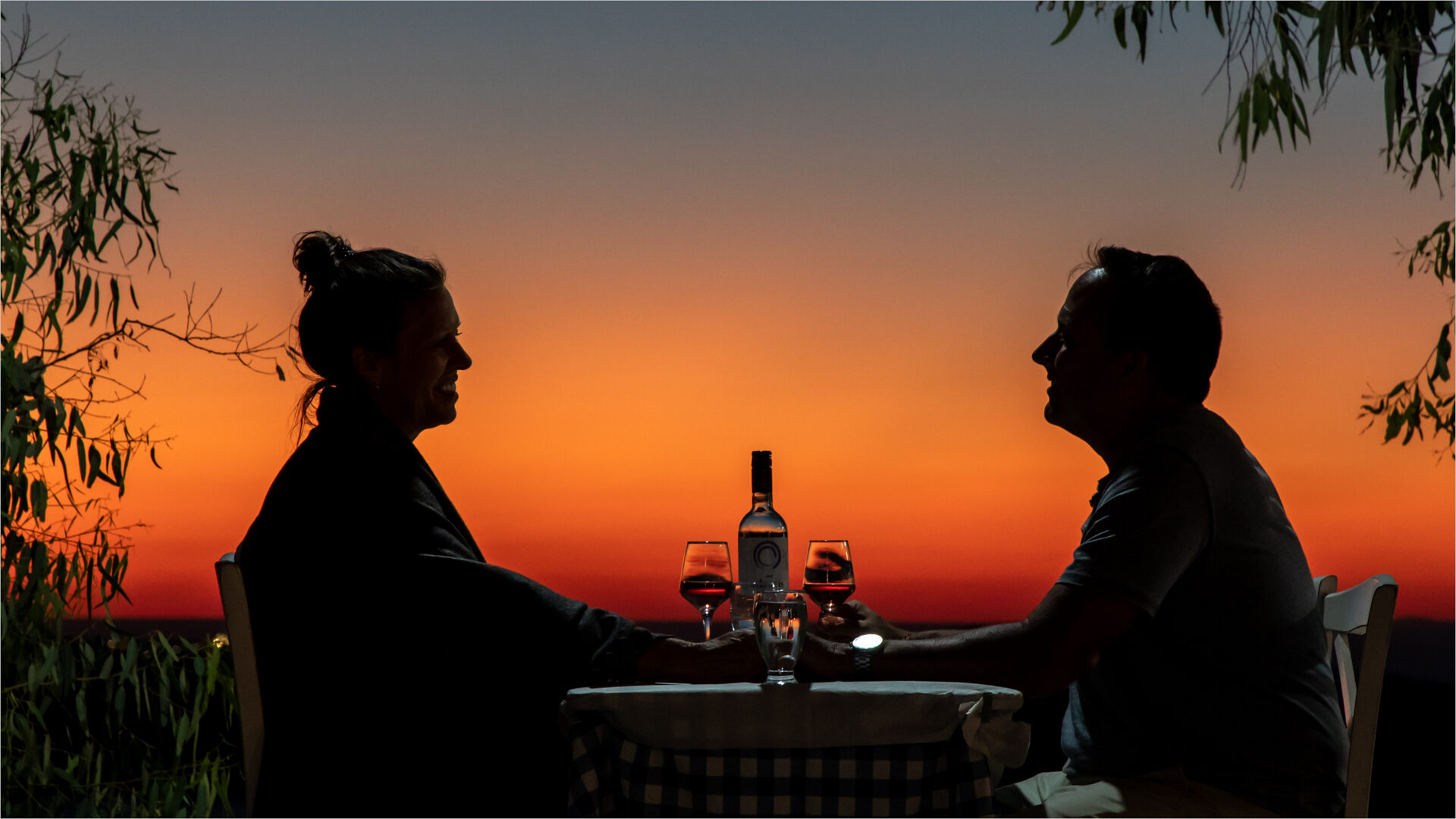
The photographer has captured people enjoying an intimate sundowner. The overall colours are warm and inviting. The figures and drinks are sharp and appropriately lit with sufficient detail. However the foliage, specially on the left hand side of the image, and the gents watch highlight, are distractions that could largely be resolved in post prod. 23, Silver.
Nature
An image, Brothers, entered in the Nature category by Carina de Klerk won Senior Image of the Month.
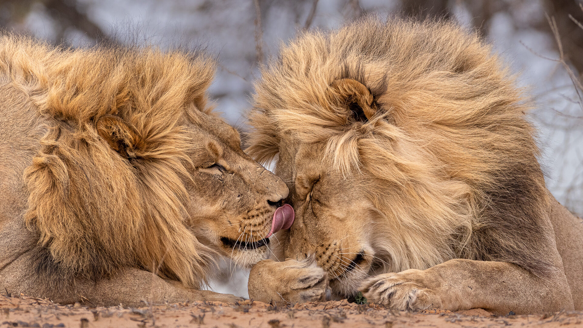
In this image the photographer has captured the interaction between these two brothers at the perfect moment, and from the perfect position. The face lick, and the two facial expressions, tell the story of their good relationship. The composition, the angle and the cropping can hardly be improved. And together with the sharpness, colours, textures and background, the end result is an excellent and beautiful picture. 27, Merit.
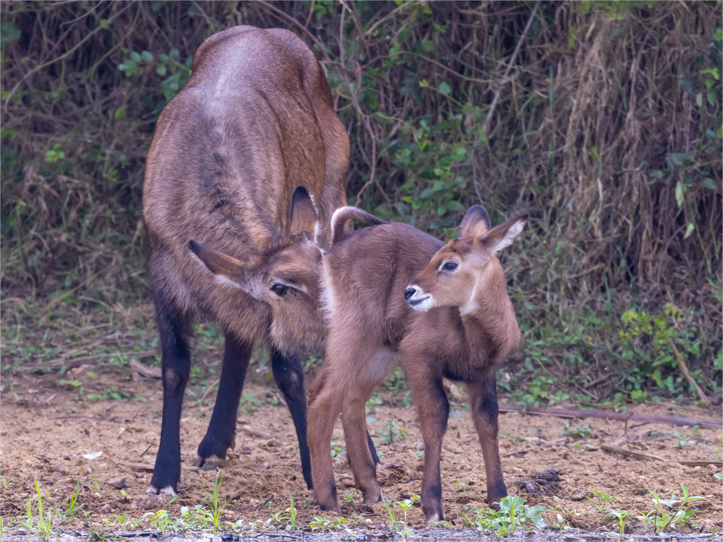
The image captures an interesting intimate moment between mum and calf. The soft / overcast conditions work in the photographers favour, there being plenty of detail throughout the image. Overall the photographer has handled all of the technicals well. The background is a little busy but given the closeness of the subjects to the background there is little to be done in camera. The image may benefit from a tighter crop, possibly even a square crop, by eliminating some of the background on the sides that is unnecessary in telling the story. 24, Gold.
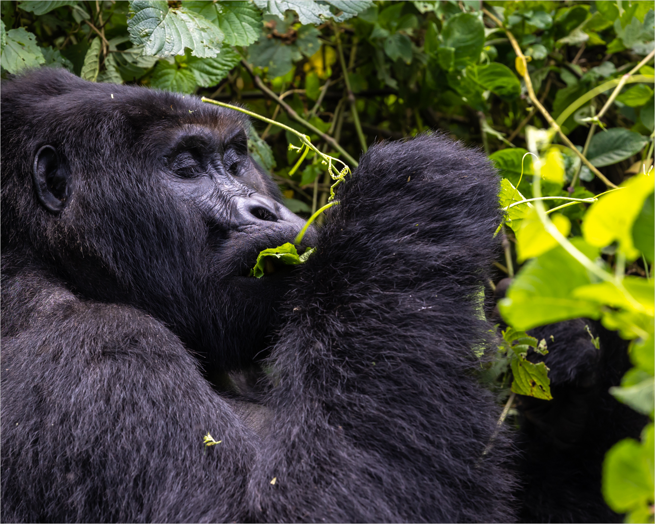
A well captured and exciting moment. Technically speaking the image is pretty well handled with good detail in the blacks and a pleasing composition. It could be improved by better handling of the right hand side leaf highlights in post prod and possibly a little more light in the shadow area around the gorilla’s mouth, where you can see his tooth. Some eye contact would have made this image a real winner. 24, Gold.
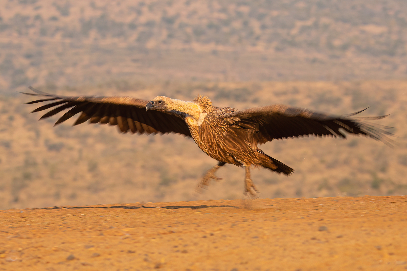
A well captured image. The head and neck are pin sharp while there is nice movement in the rest of the vulture. Exposure and feather detail are good and as is the blurred background. It may be better to crop in the 16:9 aspect ratio to eliminate some of the blurred foreground, which is unnecessary. 25, Gold.
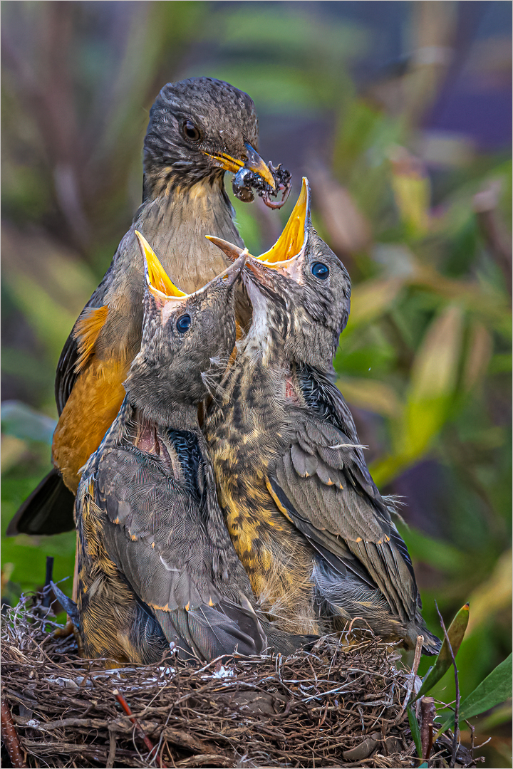
A well captured moment with mum’s beak full of tasty morsels and the youngsters eager to accept. The framing of the image is good and there are no major distractions that are often present in nest images. However there is a hint of over sharpening and the colours appear a little over saturated, especially the leaves in the background, but a good image nonetheless. 24, Gold.
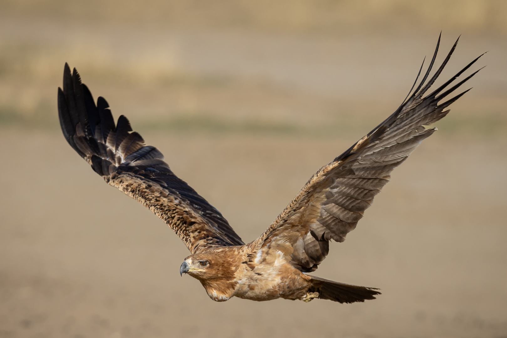
The focus is on the eye of this bird in take-off, where it should be. The colours are pleasing. The caption says the eagle is taking off, which could explain why its body is so low in the frame. But a little more space below, and even to the left, could improve the composition. 24, Gold.
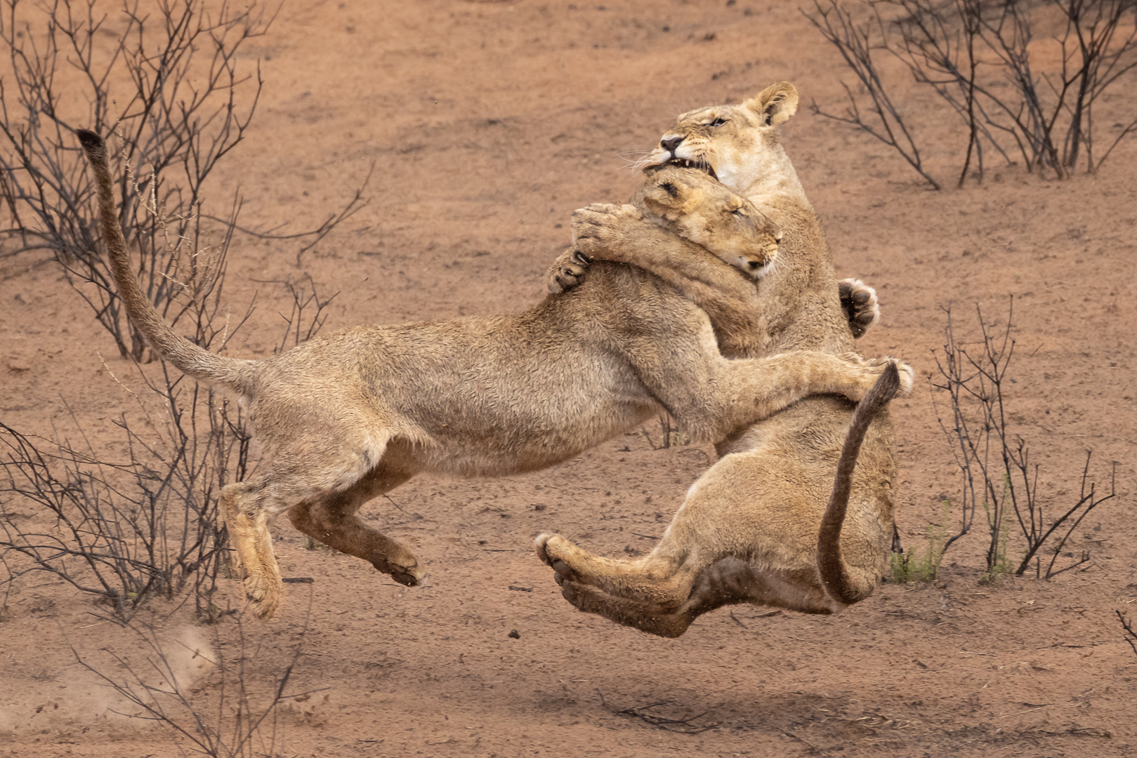
The strongest elements of this image are the good capture of the action, from a good angle, and the story-telling. Those outweigh the slight lack of sharpness, which could be ascribed to the movement of the bodies. The shrubs around the lions are not really pretty, but they do frame the action, and show the habitat. 25, Gold.
Photo Journalism
As always there were a number of PJ images. An image Early Morning Walker by Daniel Reddie was a firm favourite of the judging couple.
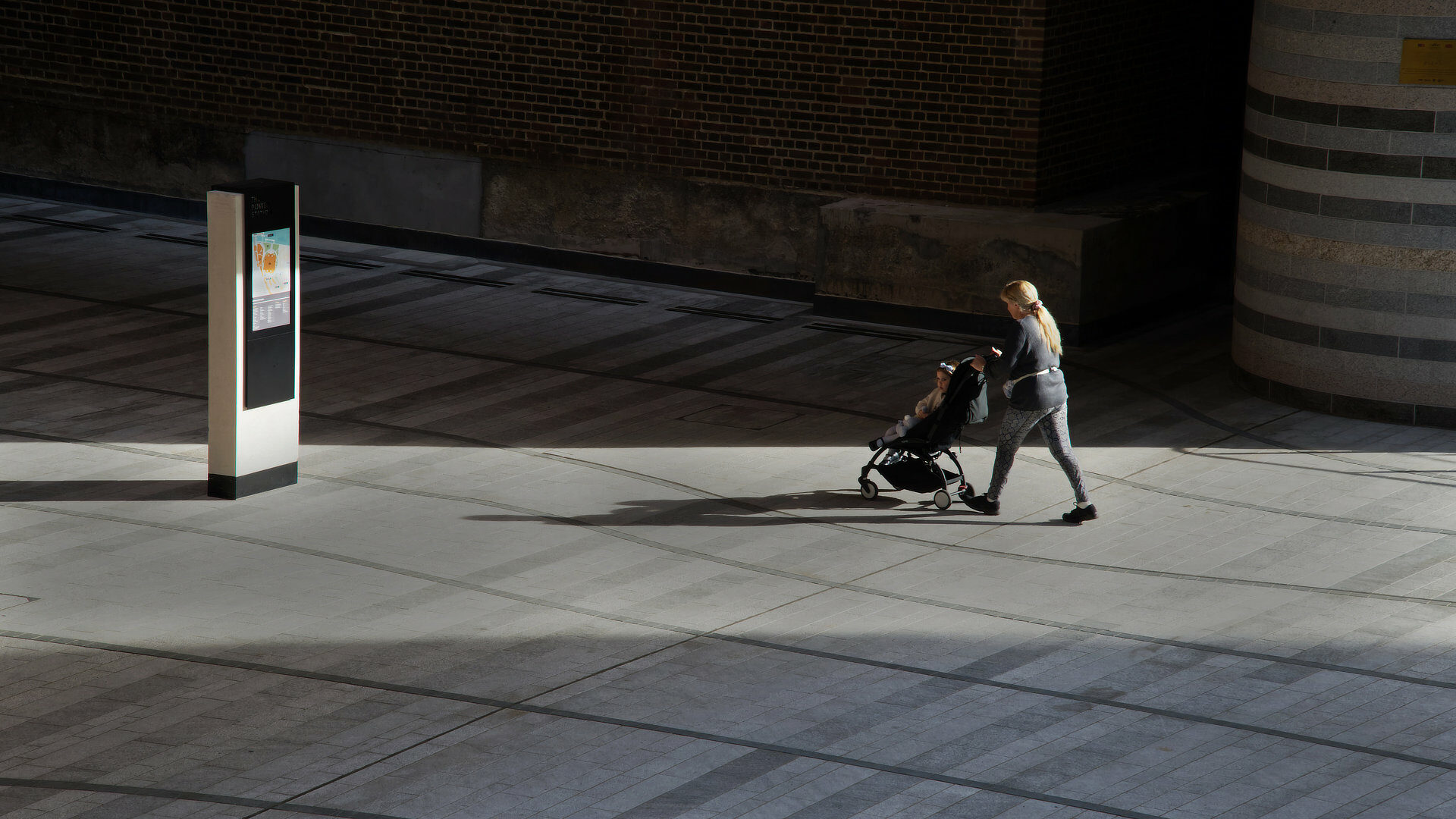
The photographer has found a moody street set-up and waited successfully for someone or something interesting to arrive or happen. The mother, child and pram works well. There’s good use of light and shadow and overall the image is visually strong. However the structure on the left hand side is too much of a distraction. This is easily remedied in post-prod by holding back on the highlights / white or even crop it out. Also consider straightening the verticals Overall a tighter crop will improve the image’s impact and it would get an even higher score. 25, Gold
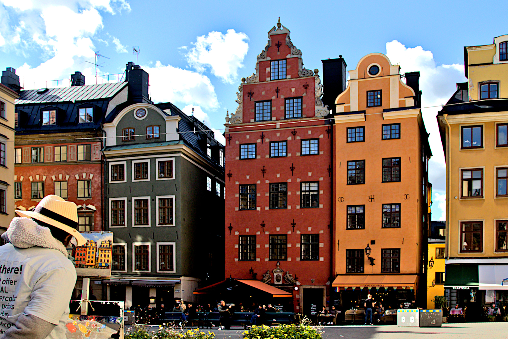
This is a picture within a picture with a street artist capturing the colourful scene in front of him. Overall its well seen and makes for interesting subject matter. But there is too much emphasis on the scene and too little on the artist who is relegated to the bottom left hand corner of the image, and amputated. The writing on the shirt of the artist could have been very distracting and perhaps the photographer wanted to avoid that. But this angle doesn’t work that well. The image is also quiet contrasty with lack of detail in the shadows and clipped highlights in the clouds. 22, Silver.
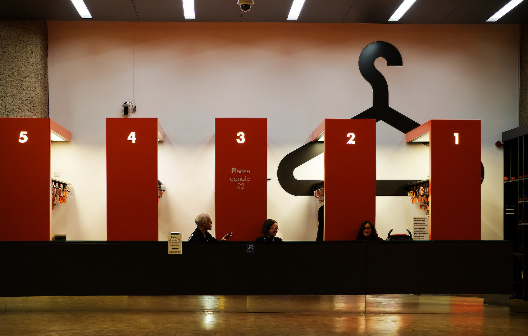
The photographer has captured some interesting interaction between the attendants. The red advancing colour and numbers work well, as does the coat hanger icon. However the image would benefit from a far tighter crop to eliminate much of the distracting highlights such as the ceiling and the floor in front of the counter. There is also loss of critical detail in the shadows. This can largely be fixed post prod. 22, Silver.
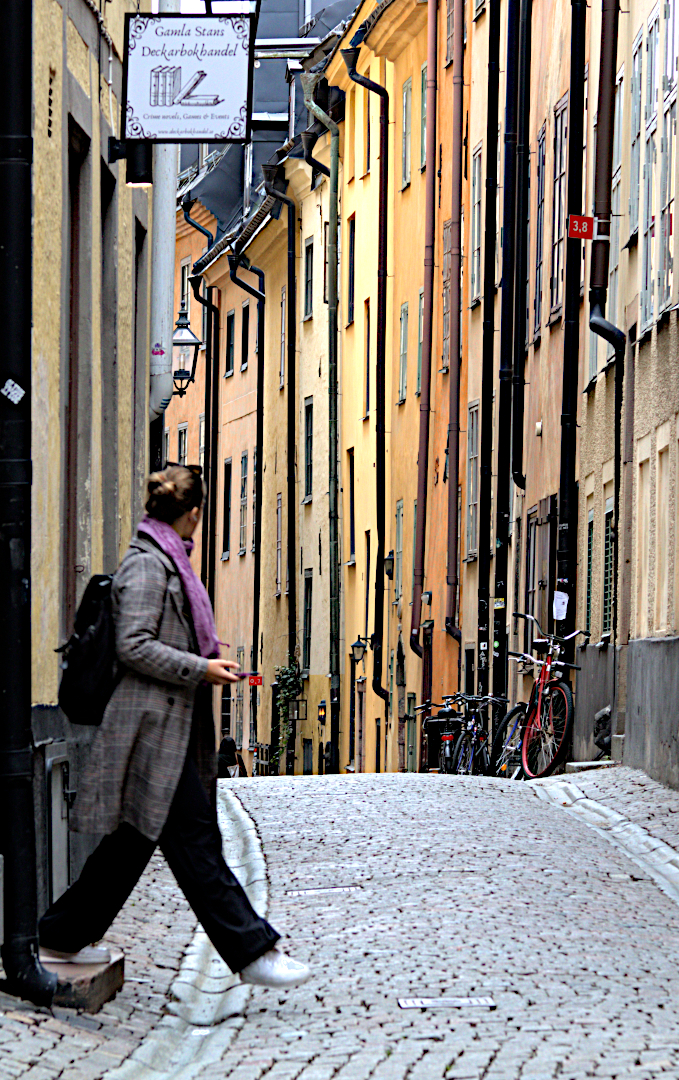
Overall the image of the street is interesting and well handled. However the name informs us of the focus area of the image, being the figure on the left hand side. It’s placed a little too close to the frame and it’s soft (out of focus), not sufficiently enough to make it interesting. The figure is also a little lost in the shadows against a relatively bright street scene. 22, Silver.
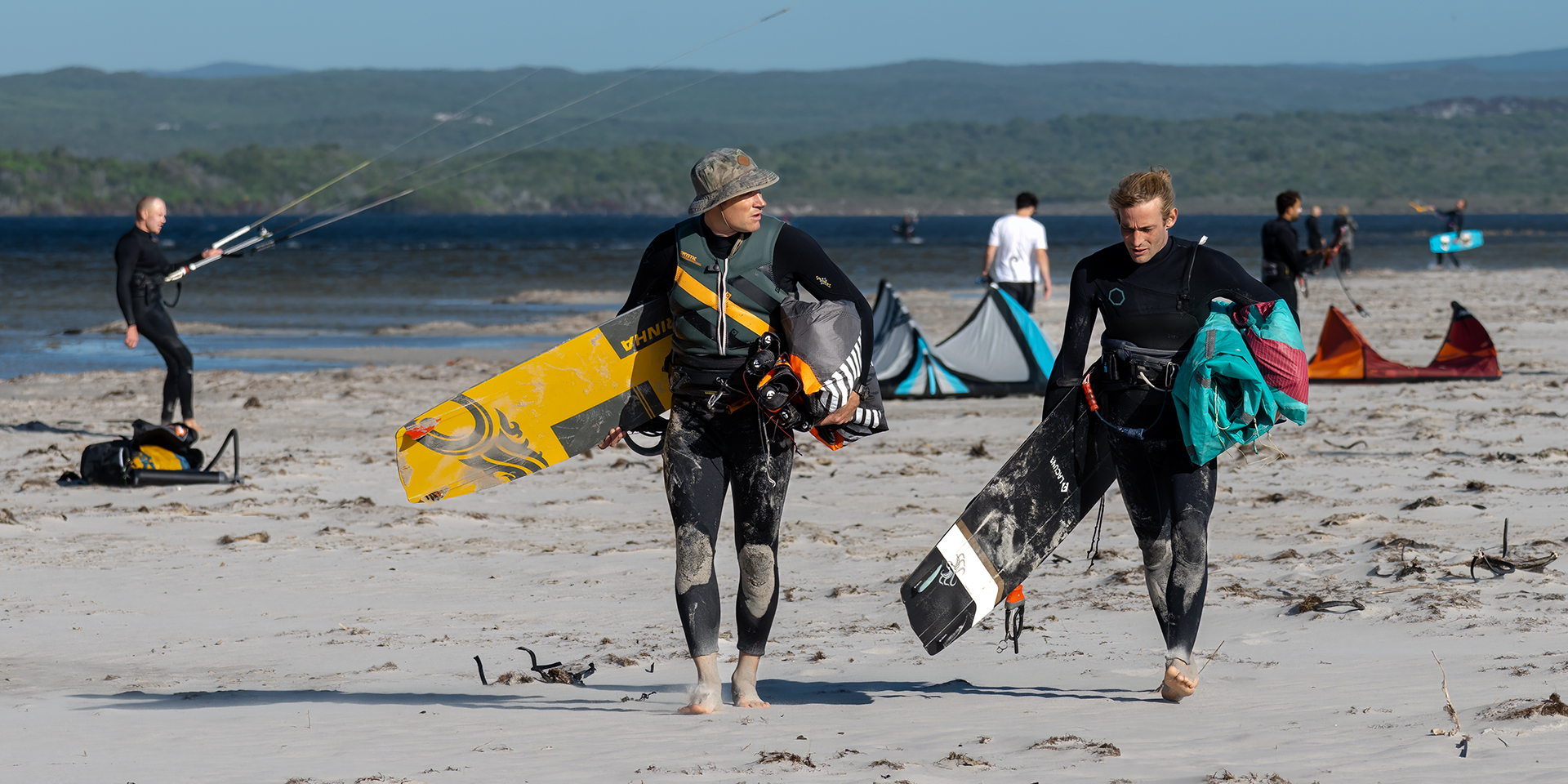
The photographer has captured the banter between two kite surfers at the end of the day. They are both sharp and well exposed. The background, while adding context to the story is a little busy with one to two distractions. If elements faded into the background, it could have worked. The image lacks that something to lift it to a higher score. 23 Silver
Contemporary
The creative approach by Mari Botes was highly commendable.
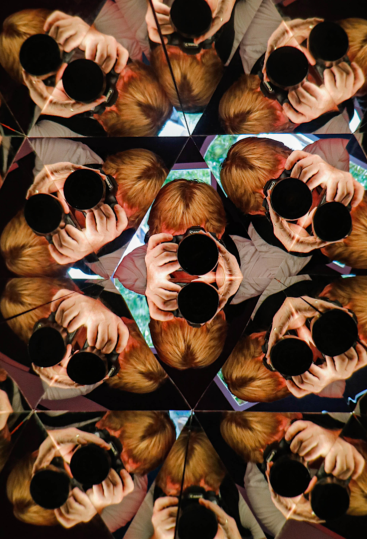
This is an original, well visualised and created image. It makes good use of repetition, essentially a pattern image. The dark lens and hand elements create interest and the blue background creates some separation between the components and helps break the pattern, while complementing the overall warm tones from the hands and copper hair of the photographer. 25, Merit.
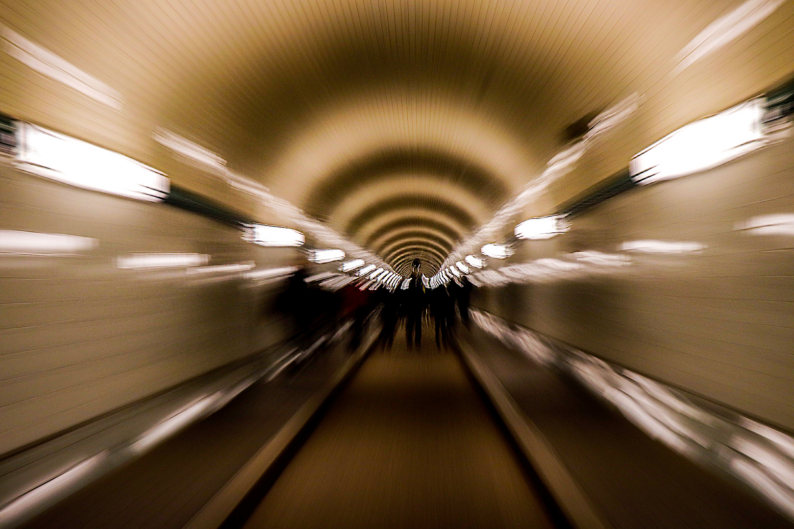
A slower shutter speed image presumably taken on a moving escalator, so its an interesting idea. The arches in the image is a strong element and can be accentuated more. Unfortunately the image creates more of ‘into the dark’ than ‘into the light’ feeling. The highlights on the periphery of the image dominates and are a large distraction and there is a loss of detail in the dark centre. To some extent this could be remedied in post production. 21, Gold.
Open
This category is always a firm favourite amongst photographers, but the judges felt that some of the images would fare better in the Nature category, unless the creator manipulates the image and therefore enters it into Open.
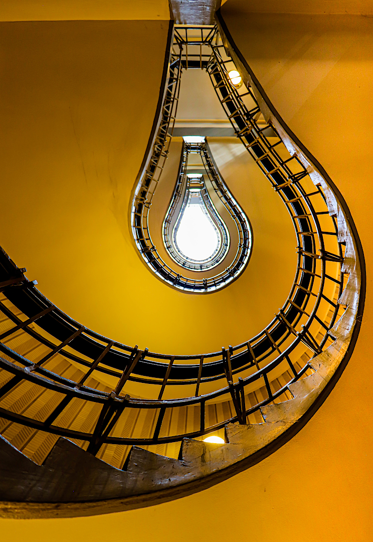
This is a well seen and visually interesting image with the central element resembling a lit light bulb or a teardrop, and the related highlight pulling your eye through from front to back. The colours and composition work well and the image is pretty sharp throughout. It can be improved further by removing some of the wall marks and stains, dampening one or two highlights and possibly cropping out the very top section of the image. It is well worth spending a little more post prod time on this, to make it an even better image . Well done. 25, Merit
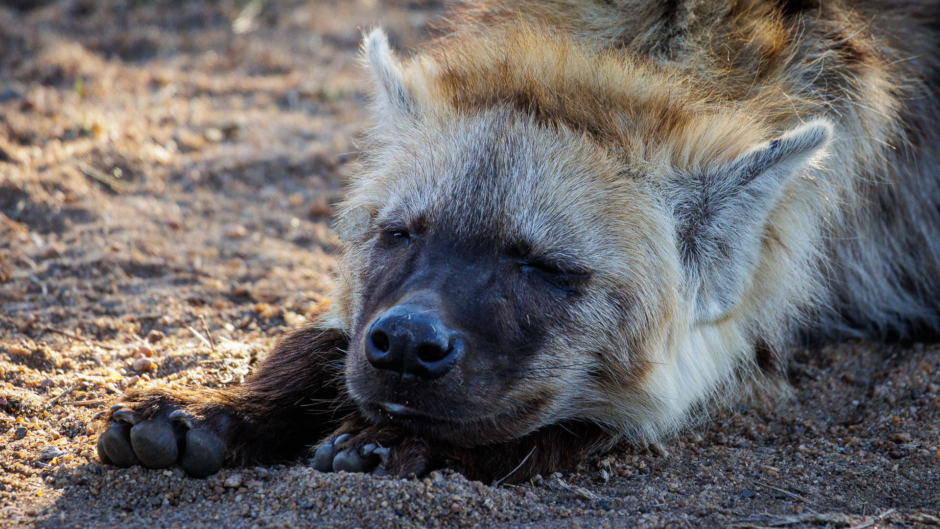
The photographer has done reasonably well with a challenging situation. The hyena is well exposed with good overall detail and even hint of a highlight in the slit of his one eye. But sleeping animals don’t always make for the most visually exciting images and they tend to rest in the shadows, as is this hyena. The main distraction is the well lit background on the left hand side. The animals nose also appears slightly soft something always to be aware of when focusing in close with larger lenses. 22, Gold.
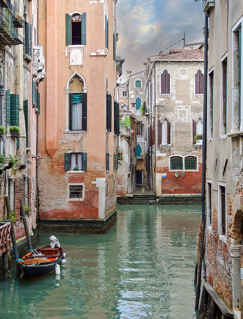
Overall a very pleasing postcard-perfect image. The composition is strong, the boat anchors the picture on the left hand side while your eye is drawn through the image and along the passageway in the background. The post prod technique suits the subject well, emphasing the soft tones, good texture and colour etc. 24, Gold.
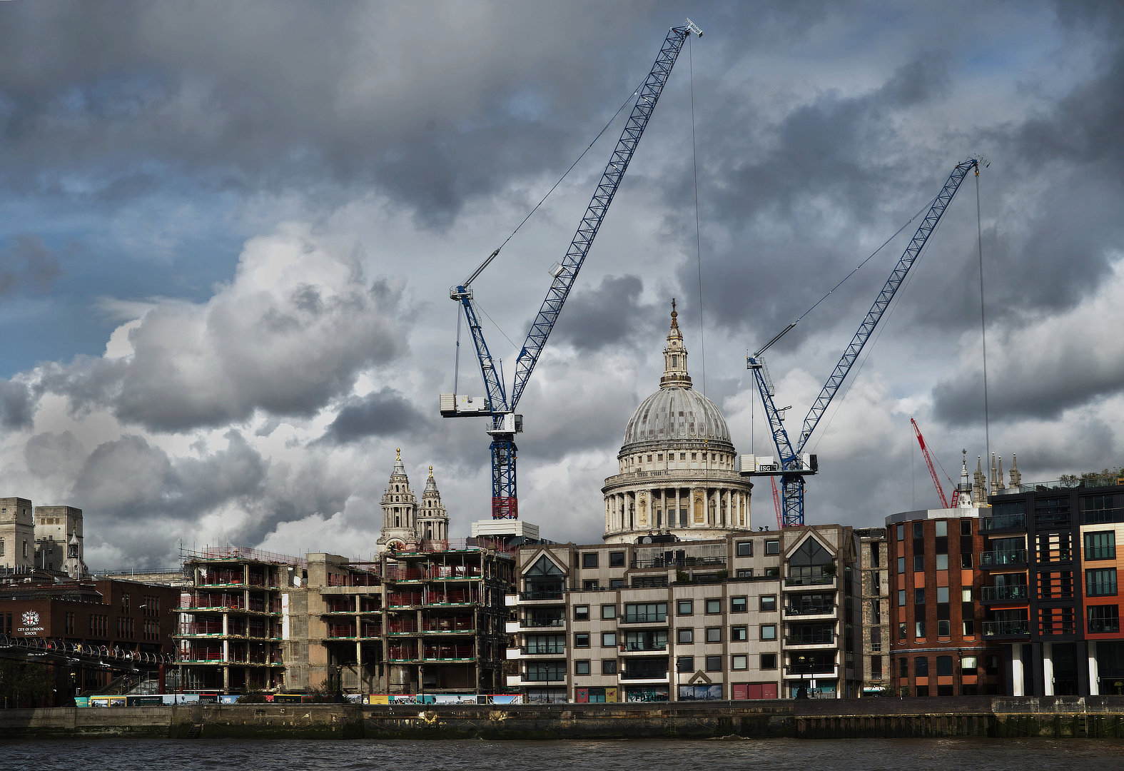
As the name implies the image portrays a busy and evolving London skyline. The cranes framing St Pauls add some dynamic elements (with the triangles and diagonals) to an otherwise visually flat image. The image lacks vibrance and luminosity with some loss of detail in the shadows. Perhaps focusing in on the cranes and St Pauls would make for a stronger image. 21, Silver.
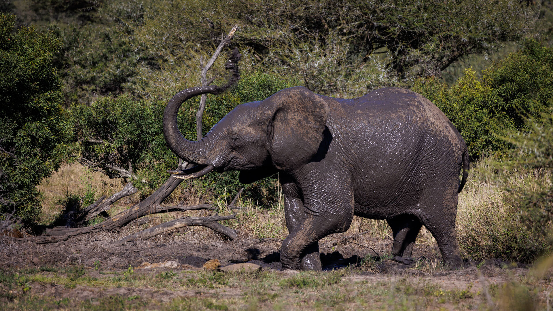
Overall the image is well exposed, often a challenge with partially wet elephants. The subdued lighting certainly helped. While the image captures an interesting moment the mud and trunk are partially lost in the busy background. Not sure why this image was entered in open as the nature category appears more appropriate and in which it may have scored higher. If used in Open category the image can be altered and the busy background altered. 22, Gold.
Scenic
We had three entrees in this category with Phil Sturgess’ image of Deadvlei pan leading the pack.
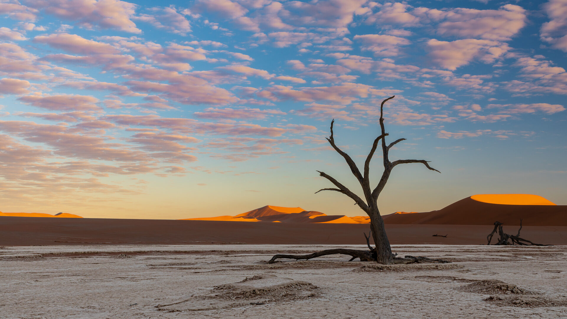
A beautiful composition of an architecturally strong dead tree, reaching up into an attractive sky. The blue of the sky is complemented well by the orangy tops of the dunes at daybreak, and the dark trunk and lower branch of the tree contrast well with the light surface of the dead vlei. It could be said that the upper and lower parts of the landscape are separated into two different pictures by the dark, horizontal band between them, but the whole picture is to a large extent bound together by the dead tree. 26, Gold.
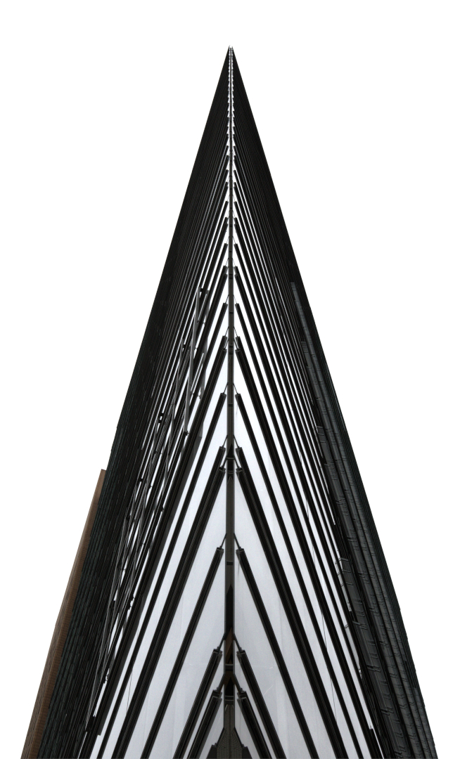
The photographer obviously paid attention to Gary’s recent guidance on architecture and symmetry as the image appears perfectly symmetrical. The repetition of triangles and layers also adds to the images appeal. While the image is technically a colour image a more contrasty and punchy mono conversion would enhance it a lot. As presented it is a little too middle-tone grey. 23, Gold.
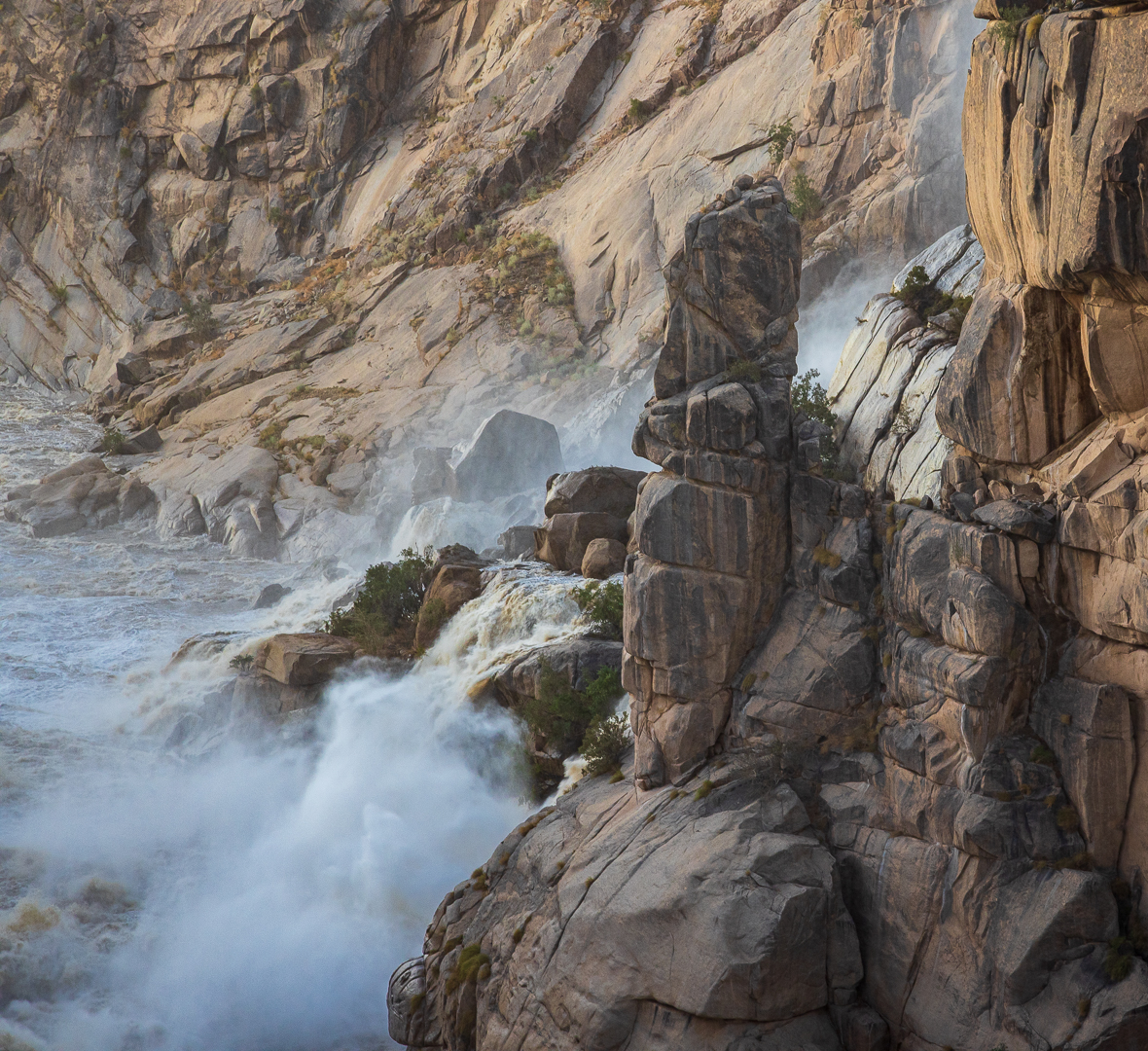
I suppose it can be challenging to move away from the spectacular main action of the Augrabies in flood, to find something else to photograph. In this case the photographer captured a composition with some pleasing rocky shapes, textures and formations. Technically good, but the end result is maybe a little subdued. 22, Silver.
Portraiture
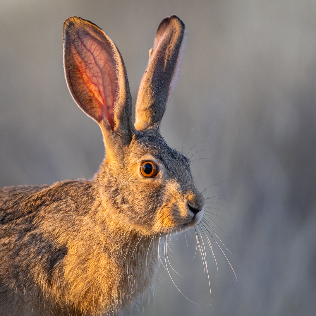
Light can be magic, especially near sunrise and sunset. It has enhanced this portrait of the rabbit, which is further raised to a higher level by the facial expression, the beautiful background, and the sharpness. 25, Gold.
Get ready for 2023
The next club meeting will be the first Wednesday in February 2023. The set subject is Bicycles. So there is plenty of time to go and find those creative images that depicts your interpretation of bicycles.
- Forget Auto Mode, switch to your manual camera setting
- Try to create depth
- Remember the background is equally important as the subject
- Tell a story with your lay-out
- Watch your lighting and
- Use composition to your advantage
In March we are looking for an image taken in the Overberg region that can form part of the FynArts Exhibition that will once again be held in June in Hermanus.
Our best wishes for the Festive Season
Hermanus Photographic Society